What Does Brand Visual Identity Consist Of?
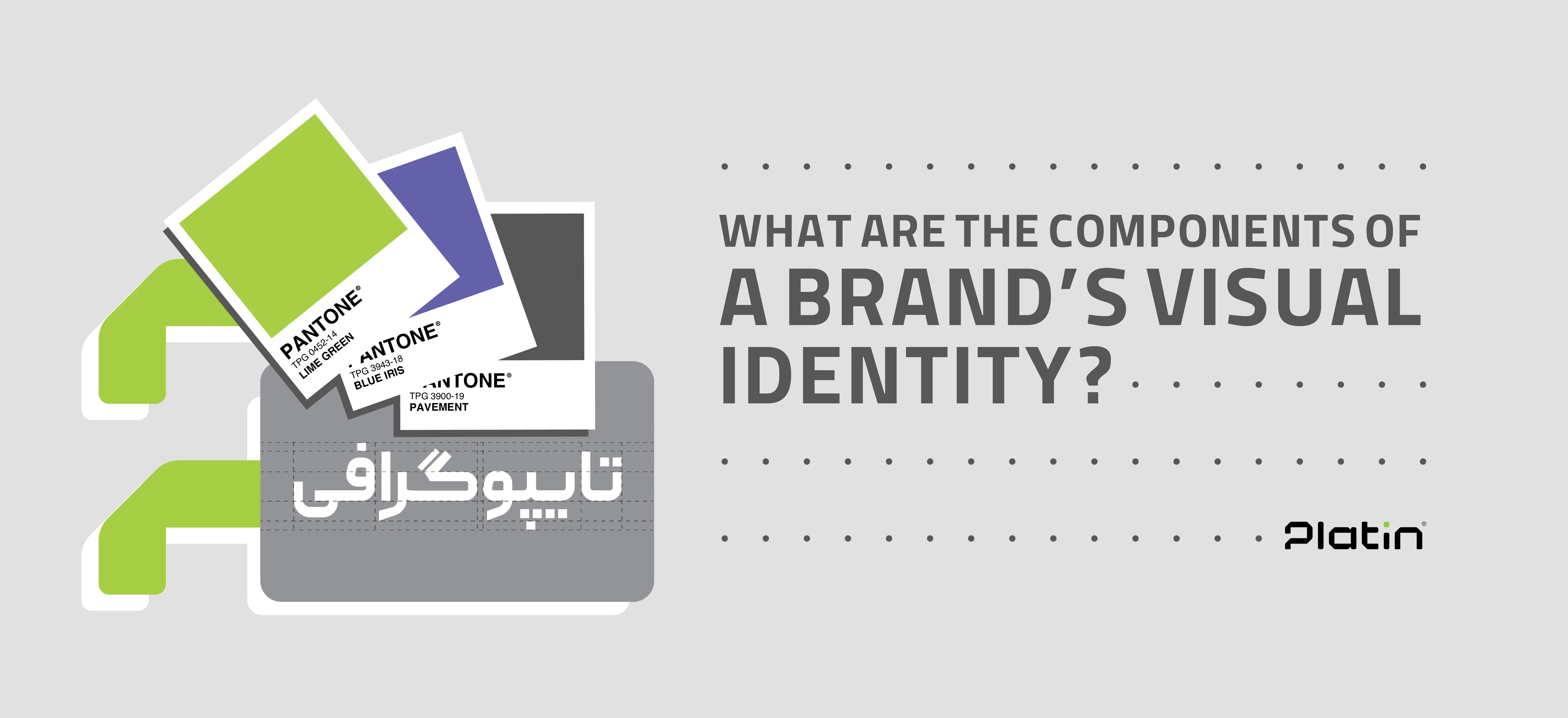
Leading brands leverage visual identity as a visual language—a system that communicates values, personality, and market positioning without relying on words. For this reason, a clear understanding of the components of brand visual identity and the role each element plays is essential for any business focused on sustainable, long-term growth. In this article by Platin, we examine what brand visual identity consists of and how each component contributes to shaping a clear and lasting brand perception in the audience’s mind.
Why Is Strategic Visual Identity Design Important?
Strategic visual identity design is critical because it shapes the audience’s first—and most enduring—impression of a brand. It directly influences brand recognition, credibility, trust, and differentiation within the market. A strong visual identity enables a brand to be instantly recognizable, communicate its message intuitively, and deliver a consistent experience across all brand touchpoints.
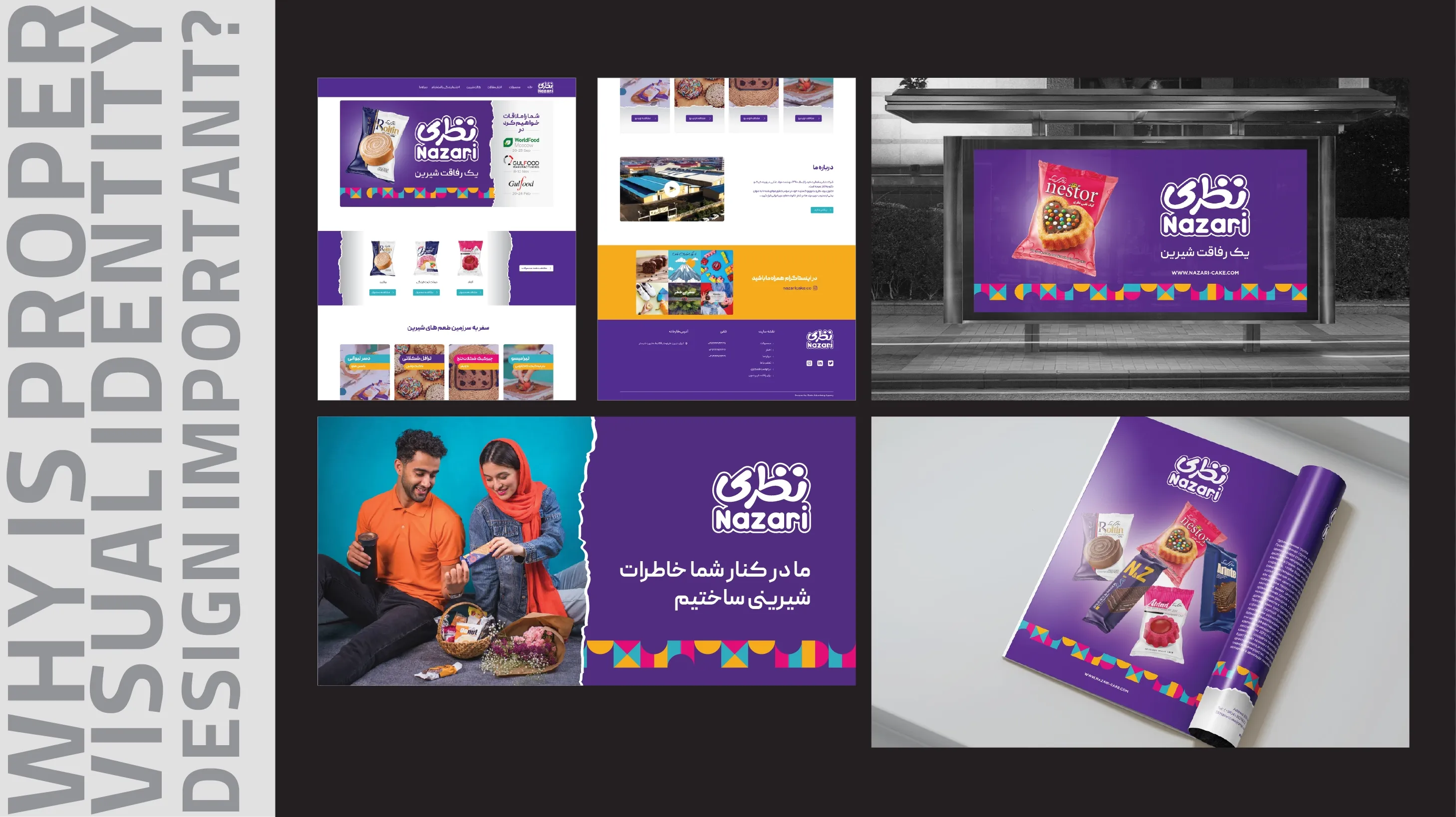
When visual elements are designed in alignment, the brand appears more professional and establishes a stronger, more credible position in the audience’s perception. Conversely, fragmented or superficial visual design can lead to confusion, diminished trust, and missed engagement opportunities. For this reason, visual identity should not be viewed as a decorative layer, but rather as a strategic instrument for brand growth, consistency, and longevity.
The Core Elements of Brand Visual Identity
Brand visual identity is a multi-layered and integrated system composed of interconnected elements. Together, these components form a distinct and recognizable brand image, enabling audiences to identify and recall the brand more easily. Visual identity is not limited to a single symbol or color; it operates alongside other brand dimensions and is fully realized when the distinction between visual and verbal identity in branding is clearly understood.
When these elements are designed cohesively and strategically, a brand can communicate its values, personality, and positioning without the need for explicit explanation.
Logo: The Strategic Foundation of Visual Identity
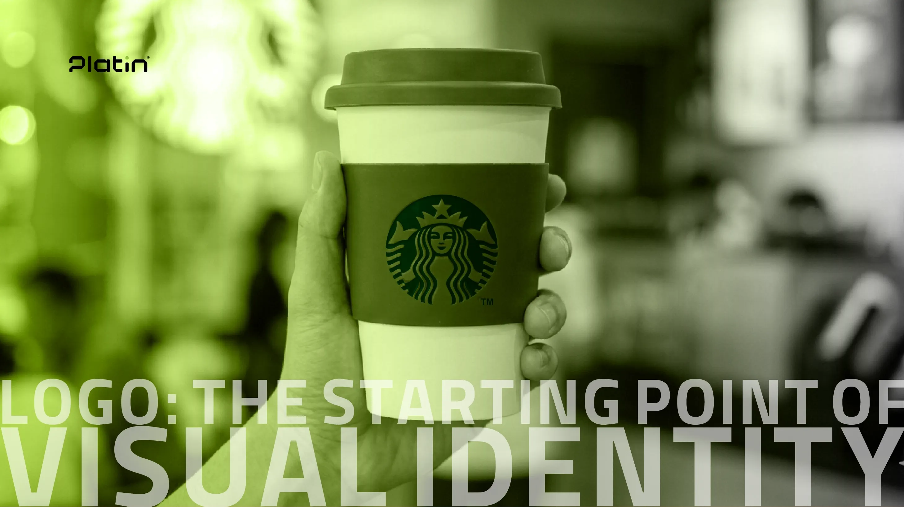
The logo serves as the core anchor of a brand’s visual identity and is often the first visual element encountered by the audience. For this reason, selecting a brand name that aligns with the brand’s essence, tone, and positioning is a crucial step before the logo design process begins. At Platin, brand naming services are approached with this strategic alignment in mind.
Within a visual identity system, the logo functions as the foundational reference point upon which all other visual elements are built. When the brand name and logo are defined within a unified strategic direction, decisions regarding color palettes, typography, and overall visual style become more coherent and intentional. As a result, the logo stands as one of the most impactful and sensitive components of brand visual identity, requiring careful consideration and strategic foresight.
Color Palette: Recognition, Emotion, and Memorability
Colors are among the fastest and most effective tools for brand recognition and play a direct role in shaping audience perception and emotional response. In many cases, audiences recall a brand’s colors before remembering its name or logo, making color palette selection a highly strategic decision.
A brand’s color palette should be limited, cohesive, and aligned with its personality and positioning. Excessive or unstructured use of colors can dilute visual focus and create confusion. Successful brands typically rely on one or two primary colors that are consistently applied across all touchpoints, gradually evolving into a recognizable visual signature. Color delivers its strongest impact when it reinforces the brand’s message and identity.
Typography: The Visual Voice of the Brand
Typography plays a vital role in expressing brand character and can be considered the brand’s visual tone of voice. Font choices influence how a brand is perceived—whether it feels formal or approachable, modern or classic, bold or understated.
In a professional visual identity system, typography is used with intention and discipline. A defined set of fonts is selected for specific applications to ensure consistency across all brand communications. Typography extends beyond font selection to include hierarchy, spacing, alignment, and overall text composition. Attention to these details enhances readability and ensures clearer, more confident communication of the brand message.
Imagery and Photography Style: Creating Emotional Connection
Imagery is one of the most influential elements of visual identity when it comes to building emotional connections with audiences. Photography style, lighting, composition, perspective, and subject matter all contribute to the brand’s visual language and should be selected based on brand personality and target audience insights.
When a brand maintains a consistent and recognizable visual style in its imagery, audiences can often identify it even without the presence of a logo. Inconsistent or random imagery can weaken brand perception, while visuals aligned with the brand’s color palette and typography create a cohesive, professional, and immersive brand experience.
Patterns, Icons, and Graphic Elements: Strengthening the Visual System
Patterns, icons, and supporting graphic elements play a complementary yet essential role in brand visual identity. Patterns are often derived from core brand elements and help reinforce visual consistency across applications. Icons, particularly within digital environments such as websites, applications, and interfaces, enhance usability and enable faster, clearer communication.
When these elements are designed in harmony with the logo and broader visual system—in terms of form, color, and style—they contribute to a structured, reliable, and memorable brand presence.
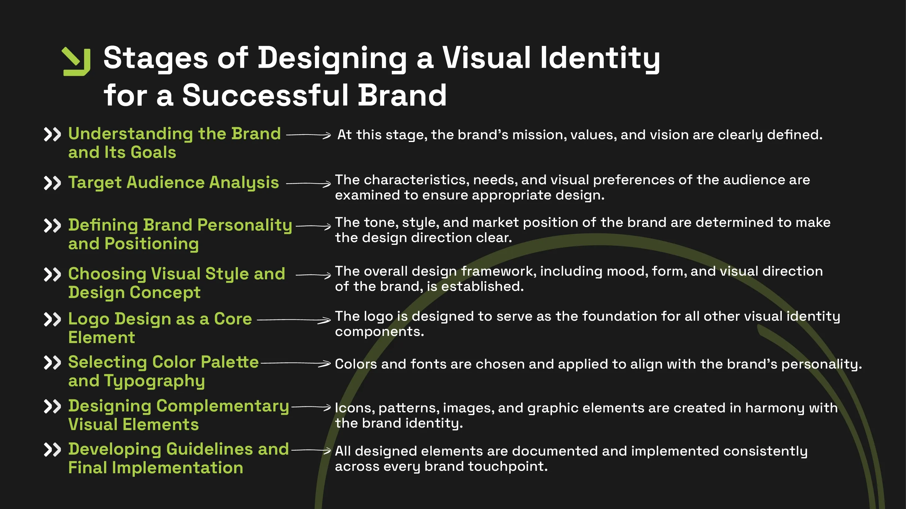
The Process of Designing a Successful Brand Visual Identity
Designing an effective brand visual identity is a structured and strategic process that begins with a deep understanding of the brand and its audience. Following a clear framework ensures the final identity is cohesive, scalable, and aligned with overall brand objectives:
Why Visual Identity Must Function as a Unified System
Consistency is the defining factor in building a clear and coherent brand image. When visual identity elements are developed in isolation, brands risk visual fragmentation, making recognition more difficult and diluting brand meaning. Disconnected design choices can result in conflicting signals across colors, typography, and graphic styles.
Successful brands treat visual identity as an integrated system rather than a collection of standalone assets. This alignment creates a familiar, trustworthy experience at every touchpoint. When logo, color palette, typography, and imagery operate within a unified direction, the brand appears more professional, credible, and scalable. Visual cohesion also streamlines campaign execution and brand expansion, ultimately strengthening brand recall and reducing audience confusion.
Conclusion
Brand visual identity elements achieve their greatest impact when they are designed with strategic intent and cohesive execution. Logos, brand colors, typography, patterns, imagery, packaging, and digital environments are all components of a single visual ecosystem that derives meaning through integration. A strong visual identity enables a brand to stand out, be recognized more quickly, and build deeper connections with its audience.
For businesses seeking sustainable growth and meaningful differentiation, strategic visual identity design is not a luxury—it is a necessity. Through a strategy-driven approach and deep brand understanding, Platin supports businesses with comprehensive branding services to create cohesive, scalable, and enduring visual identities. If your goal is to build a professional, memorable brand presence, partnering with a team that views visual identity beyond aesthetics is a decisive step forward.
FAQs
Is visual identity limited to the logo only?
No. The logo is only one component of visual identity. Visual identity also includes brand colors, typography, patterns, imagery, icons, packaging, stationery, and digital brand environments. Together, these elements shape the complete brand image.
Which visual identity elements have the greatest impact?
The logo and brand colors typically create the strongest initial impression. However, without consistent typography, aligned imagery, and cohesive execution, their impact remains incomplete. The true strength of visual identity lies in the harmony of all elements.
Do small businesses need a complete visual identity?
Yes. Even small businesses benefit significantly from a cohesive visual identity. A professional visual system helps smaller brands build credibility, stand out in competitive environments, and achieve faster recognition among their target audience.