Static vs. Dynamic Visual Identity
Return to Blogs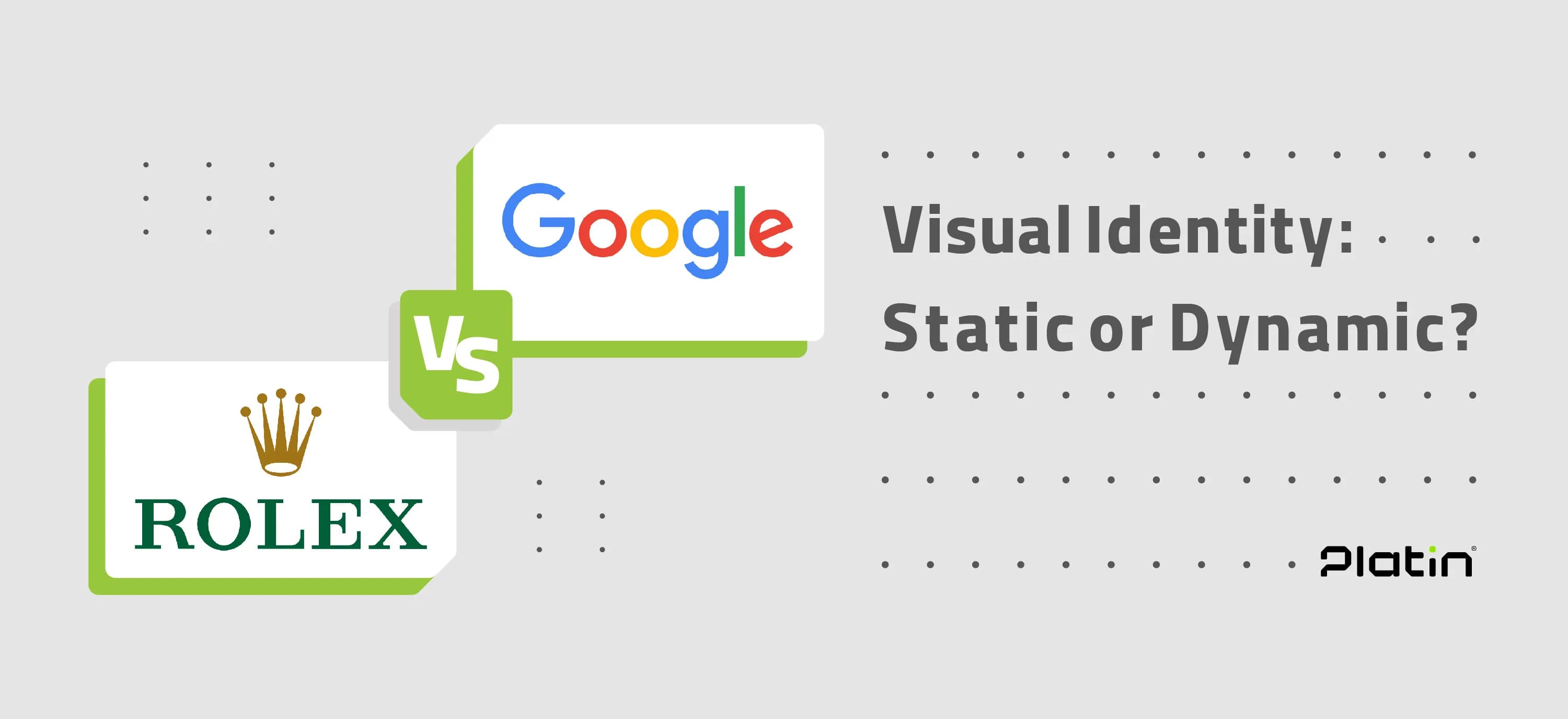
Introduction
Visual identity plays a critical role in shaping how brands are perceived by their audiences. As brands evolve to meet the needs of a changing world, two main approaches to visual identity have emerged: static and dynamic visual identities. Each of these strategies has unique characteristics, strengths, and challenges that make them suitable for different types of brands and industries. This article explores the differences between these two approaches, their features, and how they align with the needs of modern branding.
Static Visual Identity: Consistency as a Foundation
Definition and Characteristics
A static visual identity relies on fixed design elements that remain unchanged across all brand touchpoints. These elements typically include logos, color palettes, typography, and design guidelines that do not vary over time. The primary goal of this approach is to create brand recognition and build trust through consistency.
For example, Coca-Cola’s logo, with its distinctive typography and iconic red color, has remained virtually unchanged for decades. This enduring consistency has solidified its position as one of the world’s most recognizable brands. Notably, static branding works best in industries like finance, healthcare, and government organizations, where consistency and reliability are essential.
Static Logos and Concepts
Static visual identity, emphasizing stability, consistency, and coherence across all aspects of a brand, is particularly suitable for brands that communicate traditional values, trust, and enduring quality. This approach can be categorized into two key components: static logos and static concepts.
Static Logos
Static logos feature unchanging designs that remain consistent over time. This quality helps audiences easily identify and trust the brand. Rolex, for instance, uses a static logo that reflects its image of quality and luxury, remaining unchanged for decades. Chanel also exemplifies this approach with its timeless logo, symbolizing durability and a focus on quality in the fashion and beauty industries.


Static Concepts
Static concepts ensure that all brand elements, from visual designs to messaging, operate in a coordinated and consistent manner. For example, Nike’s overall brand concept is rooted in stability, revolving around its iconic "Just Do It" slogan, even as the company employs creative and diverse campaigns. Similarly, McDonald’s maintains a consistent brand concept based on family values, quality, and accessibility, despite changes in advertising details.

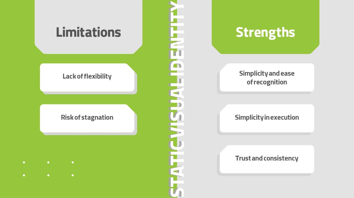
Strengths of Static Visual Identity
Simplicity and Recognizability:Static identities are easier for audiences to remember and recognize due to visual consistency.
Ease of Implementation: Clear and unchanging guidelines simplify branding processes.
Trust and Stability: Consistency conveys reliability and professionalism, appealing to audiences who value tradition and trust.
Limitations of Static Visual Identity
Lack of Flexibility: Static identities may struggle to adapt to different platforms, audiences, and cultural contexts.
Potential for Stagnation: Over time, a static identity may appear outdated, especially in fast-paced industries.
Dynamic Visual Identity: Adaptability for the Modern Era
Definition and Characteristics
Dynamic visual identity embraces flexibility and change in designing brand elements. This approach allows design elements to evolve while preserving the brand’s core values. For example, a dynamic logo might change its shape, color, or animation depending on the context in which it appears, while still retaining identifiable features.
A prominent example is MTV’s logo, which constantly adapts to align with cultural themes, events, or movements. This adaptability reflects the brand’s vibrant and youthful identity. Dynamic identities are particularly effective for brands in creative industries where innovation and adaptability are key, such as entertainment, technology, and startups.
Dynamic Logos and Concepts
Dynamic visual identity, highlighting flexibility and vibrancy in branding and communication, can be divided into two main aspects: dynamic logos and dynamic concepts. Each plays a unique role in expressing dynamism in a brand’s visual identity.
Dynamic Logos
Dynamic logos, unlike static ones, feature flexible designs that can change based on context, events, or audience. These changes may involve colors, shapes, patterns, or even animations. The primary objective of dynamic logos is to maintain brand recognition while offering freshness and appeal. A notable example is Google’s logo, which evolves through its Doodles to celebrate various occasions. This approach fosters engagement and creativity while creating closer connections with audiences. Similarly, MTV’s dynamic logo changes based on cultural themes, events, or audiences, keeping the brand fresh and relevant to newer generations.
.webp&w=3840&q=75)

Dynamic Concepts
Dynamic concepts extend beyond logos to include all aspects of a brand’s visual identity and messaging. This approach enables brands to adapt their elements to meet changing audience or market needs while maintaining overall coherence. Coca-Cola is an excellent example of a brand with a dynamic concept. While its logo remains static and unchanging, its brand concept is highly dynamic. Campaigns like "Share a Coke," featuring personalized names on bottles, or special packaging for national and global events demonstrate creativity and flexibility. Other brands, such as Uber, showcase dynamic concepts through constant updates to app design and digital interactions.
.webp&w=3840&q=75)

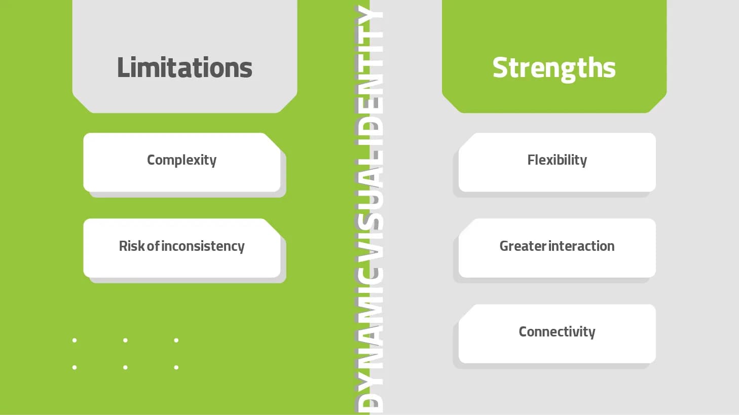
Strengths of Dynamic Visual Identity
Flexibility: Dynamic identities excel at adapting to various media, platforms, and cultural contexts.
Increased Engagement: The evolving nature of dynamic designs can capture audience attention and drive interaction.
Relevance: Dynamic identities allow brands to stay updated by aligning with trends or audience preferences.
Limitations of Dynamic Visual Identity
Complexity: Creating and managing a dynamic identity requires meticulous planning and skilled designers.
Risk of Incoherence: Without proper guidelines, a dynamic identity may dilute the brand message and confuse audiences.
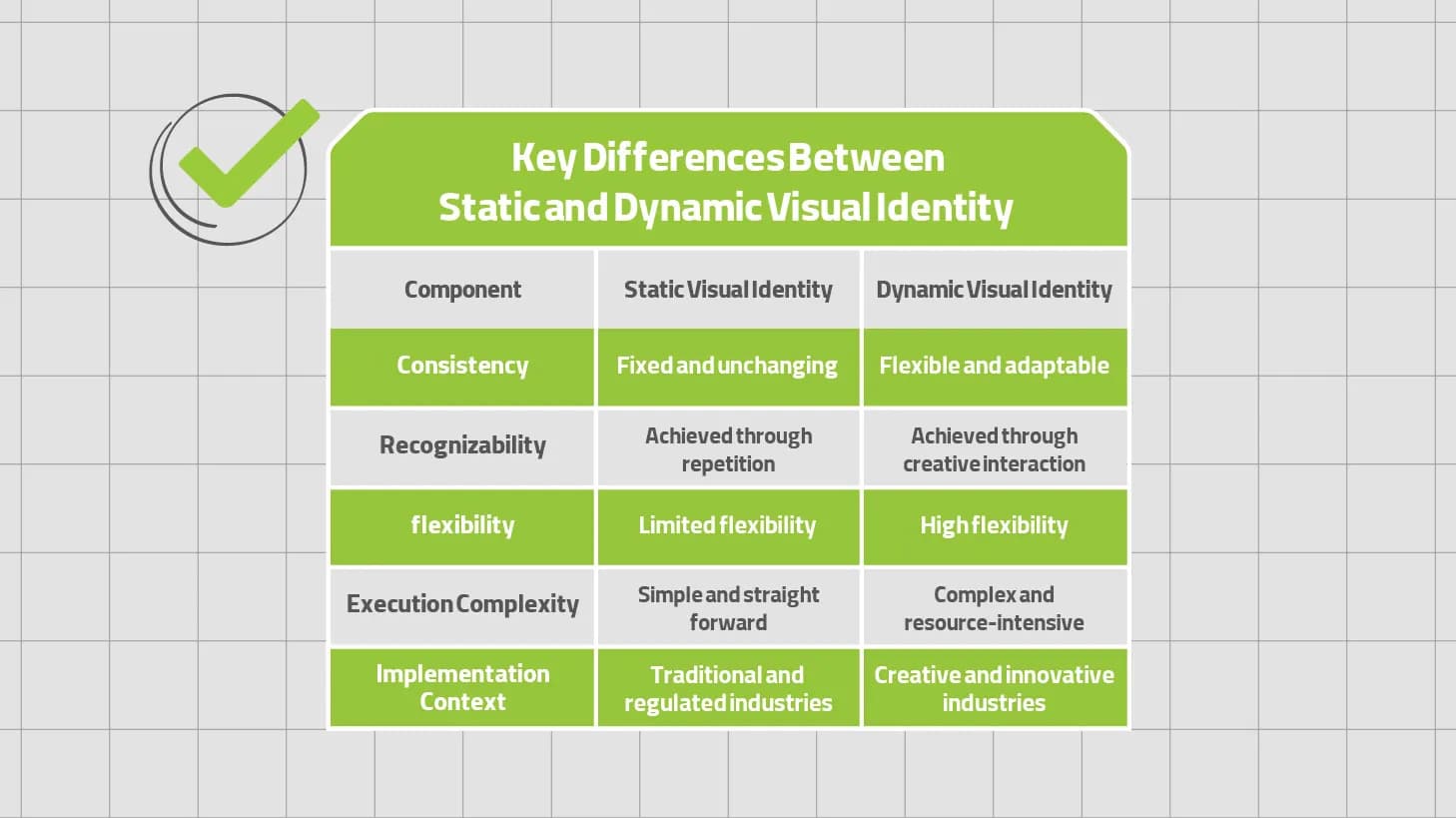
Key Differences Between Static and Dynamic Visual Identity
When to Choose Static or Dynamic Visual Identity
Static Visual Identity is Ideal For:
Established Brands: Companies with a long history that value tradition (e.g., luxury brands like Chanel).
Regulated Industries: Organizations where consistency is crucial for compliance, such as banks or pharmaceutical companies.
Resource-Limited Businesses: Small businesses or startups that need a simple and cost-effective branding approach.
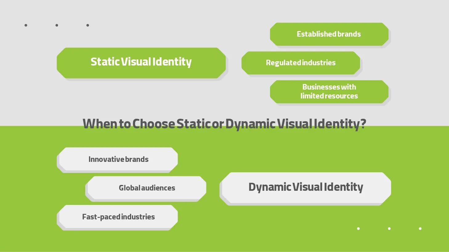
Dynamic Visual Identity is Suitable For:
Innovative Brands: Companies showcasing creativity and adaptability (e.g., Google with its occasional logo changes).
Global Audiences: Brands targeting diverse cultural or geographic markets where adaptability is key.
Fast-Paced Industries: Sectors with rapidly changing trends, such as entertainment or technology.
Implementation Challenges
While static identities are easier to implement, they may occasionally require updates to prevent obsolescence. For example, logos from the 1990s often need modernization to remain relevant in today’s digital world. Conversely, managing dynamic identities demands robust design systems and clear guidelines. Success in implementing these identities hinges on balancing consistency with creativity.
Practical Examples of Dynamic Visual Identity
Two standout examples of dynamic visual identity implementation are the Tehran branch of Helium Park and Dot Club, both developed by the specialized departments of Platin Marketing and Communications Agency. In the Helium Park project, the brand’s logo was designed as static to ensure stability and recognizability. Meanwhile, other visual elements, such as graphic designs and environmental color schemes, were dynamically created to enhance flexibility and appeal. This hybrid approach successfully met both coherence and adaptability needs. Conversely, in Dot Club, all visual identity components, from the logo to graphical elements, were designed entirely dynamically. This strategy enabled the tech-focused Dot brand to align with audience needs and foster more interactive and modern connections. These two examples illustrate how dynamic visual identity can positively impact both marketing needs and audience experiences.
.webp&w=3840&q=75)
Conclusion
Static and dynamic visual identities represent two ends of the branding spectrum, each with its unique benefits and challenges. While static identity emphasizes consistency and trust, dynamic identity focuses on adaptability and engagement. Choosing between these approaches depends on the brand’s goals, target audience, and industry context.
In the future, we may witness a blend of these approaches, where brands leverage the stability of static identities alongside the flexibility of dynamic ones. However, successful execution of either strategy requires meticulous planning and attention to detail to ensure the brand identity is effectively and memorably presented.