

Brand color is one of the most critical elements of an organization’s visual identity. It serves as a key identifier for brand recognition and plays a vital role in attracting and engaging audiences. Brand colors evoke specific emotions and have a direct impact on the audience’s subconscious perception.
However, the importance of brand color goes far beyond emotional influence. Choosing and using colors correctly creates harmony among all brand elements, resulting in visual consistency and cohesion.
If you are planning to select the right color palette for your brand, we recommend reading this article by Platin before taking any action, so you can make a smart and informed decision.
Brand colors refer to a set of colors that a brand uses to express its visual identity. These colors must be selected in alignment with the brand’s purpose, message, and personality. Typically, a brand color system includes a primary colorand several secondary (supporting) colors.
The primary color plays a central role in the logo, while secondary colors are used to create variety and reinforce visual consistency.
Brand colors are applied across websites, logos, advertising materials, employee uniforms, and product packaging to ensure the brand appears unified and easily distinguishable from competitors. When used correctly, they enhance brand memorability and help establish a strong emotional connection with audiences.
Colors are often the first element through which a brand communicates its personality and values. Consistent use of a defined color system across brand visuals can increase brand recognition by up to 80%, allowing audiences to identify products more quickly.
The key reasons behind the importance of brand colors include:
Using a consistent and appropriate color palette helps a brand stand out clearly among competitors. A well-known example is Coca-Cola, which is instantly recognizable through its distinctive red color.
Each color conveys specific meanings and emotions. Selecting colors that align with brand identity enables the creation of a strong emotional bond with customers.
For instance, healthcare brands often use calming colors, while food brands frequently apply bold and vibrant colors to stimulate appetite.
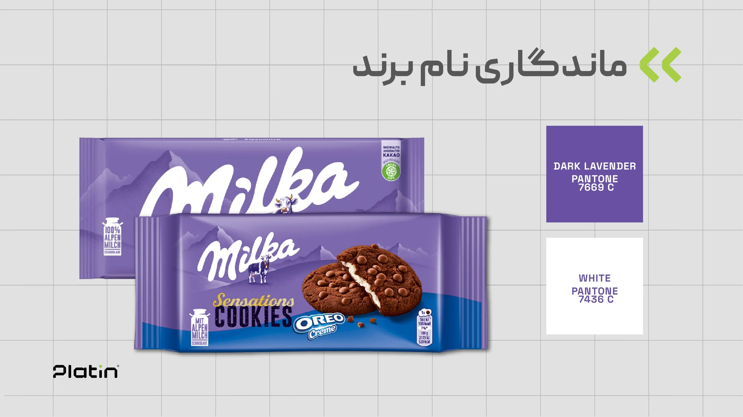
Brand color plays a major role—up to 80%—in improving brand name recognition. When a specific color appears consistently across all brand touchpoints, it becomes strongly associated with that brand in the audience’s mind.
Using a cohesive color system across logos, packaging, websites, and advertising ensures the brand appears integrated, professional, and competitive in the marketplace.
Before beginning the branding or marketing process, it is essential to understand color psychology in order to choose the most effective colors for your business.
Visual identity design experts recommend selecting colors that enhance consistency across logos and visual elements.
Red: Represents passion, excitement, and energy. Many well-known brands use red to capture attention and stimulate emotions.
Green: Associated with health, growth, and nature. Environmentally conscious brands frequently use green in their visual identity.
Blue: Symbolizes trust, calmness, and security. It is widely used by technology and financial service brands.
Yellow: Conveys positivity, happiness, and energy. Entertainment and leisure brands often use yellow to evoke excitement.
Selecting brand colors that align with a brand’s mission and values enhances credibility, strengthens brand positioning, and builds customer trust.
Appropriate colors significantly influence emotional engagement and ensure that brand messages and values are communicated accurately.
For example, using calming colors in health-related product packaging reinforces the brand message and encourages customers to make informed and confident choices.
To build a standardized and effective color palette, the following principles should be observed:
Primary Color Selection: This color should reflect the brand’s personality and core message and be dominant across the website, logo, and marketing materials.
Secondary Colors: Choose two or three complementary colors that harmonize with the primary color and can be used for icons, accents, and backgrounds.
Neutral Colors: Colors such as black, white, and gray help create balance and highlight both primary and secondary colors.
Organizations that understand the importance of brand color use consistent palettes to communicate messages faster and more effectively.
Consistent colors in advertising strengthen brand recall and differentiation, while inconsistency weakens visual identity and brand messaging.
Colors also evoke emotional responses—for example, red conveys excitement, while blue conveys calmness. When a consistent color palette is applied across all brand touchpoints, it builds trust and leaves a lasting, professional impression.
Coca-Cola uses red to represent energy, excitement, and passion—perfectly aligned with the dynamic nature of the brand. Consistent use of this color has made the brand highly memorable worldwide.

Blue in Facebook’s visual identity conveys trust, security, and calmness—essential qualities for a global communication platform.
Green reflects nature, calmness, and sustainability, aligning with Starbucks’ emphasis on quality products and environmental responsibility.
Yellow represents warmth, happiness, and friendliness, helping McDonald’s stand out visually and emotionally among competitors.
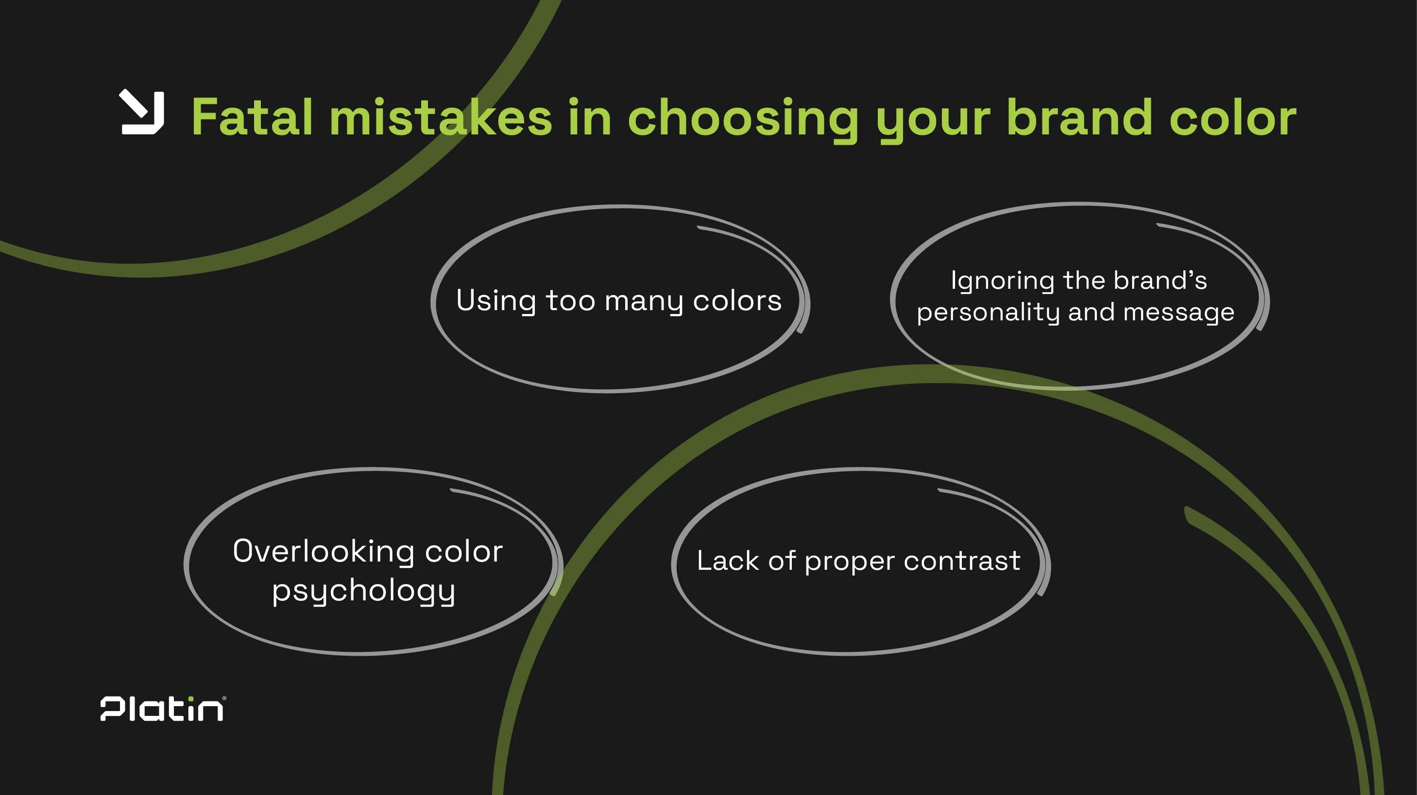
Common mistakes include:
Brands may update their colors to refresh their image, stay relevant, reposition themselves, attract new audiences, or signal changes in ownership or strategy. Strategic color changes can improve brand perception, eliminate negative associations, and rebuild trust.
Key considerations include:
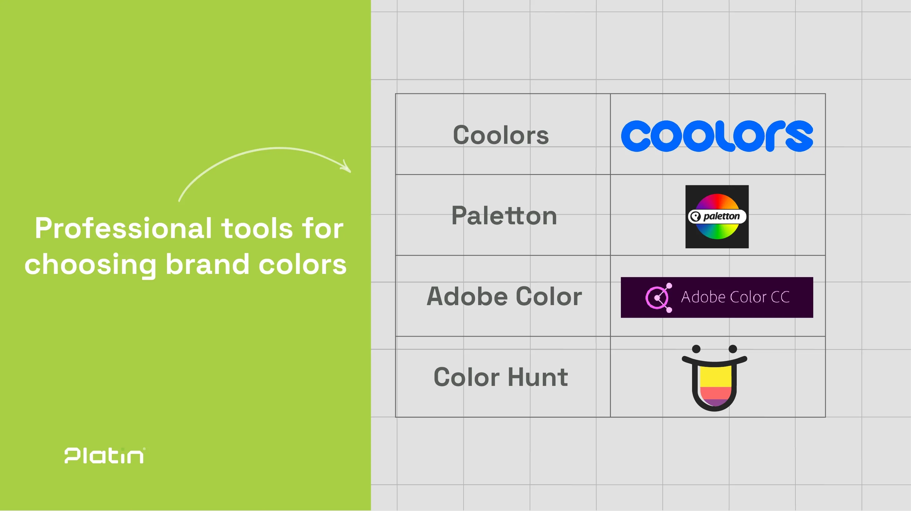
Brand color plays a vital role in visual identity by communicating brand values, enhancing recognition, increasing memorability, and building credibility.
Choosing the right colors aligned with brand identity helps create a lasting image across all platforms and fosters long-term engagement with audiences.
No. Brand colors are applied across packaging, websites, advertising, and all brand elements.
Yes. Consistency strengthens visual identity and brand differentiation.
They enhance brand recognition, influence emotions, reinforce identity, and improve audience perception.
