

In this guide, we explore how brand typography shapes visual identity, supports brand strategy, and contributes to a cohesive brand experience.
Brand typography is the art and science of choosing fonts that align with a brand’s essence and communicate its message effectively. Fonts are not just tools for displaying text—they are an essential component of a brand’s visual language, capable of shaping audience perception and emotional connection.
Key benefits of effective brand typography include:
Typography is a powerful tool for expressing a brand’s personality. Choices in font style, size, spacing, and weight evoke specific feelings and associations. Classic fonts communicate reliability and authenticity, while modern, minimalist fonts signal forward-thinking and innovation.
Using consistent typography across websites, social media, and advertising builds recognition and strengthens emotional connections with audiences. Over time, a coherent typographic style becomes synonymous with the brand, reinforcing both professionalism and trustworthiness.
In essence, brand typography functions as a visual language, conveying brand values, tone, and emotions. When applied correctly, it creates a cohesive, trustworthy, and memorable brand identity.
Typography is more than selecting a font—it represents the brand’s voice. Missteps in font selection or usage can undermine a brand’s credibility, coherence, and professionalism. Common mistakes include:
When choosing a brand font, consider these criteria:
Typography is a foundational element of a brand’s visual identity. Fonts create perception: clean sans-serif fonts convey modernity and professionalism, while traditional or curved fonts communicate warmth, trust, and authenticity.
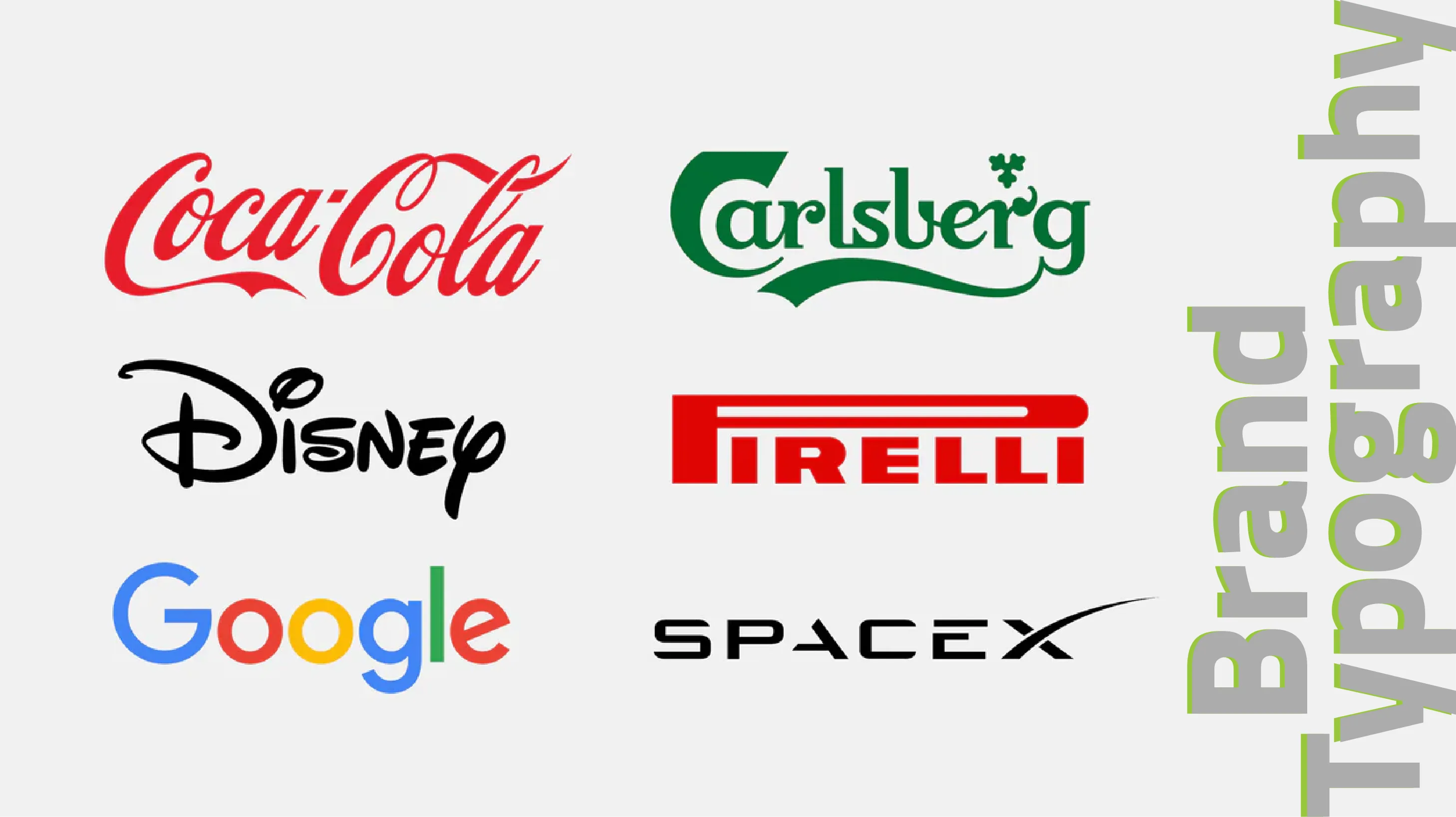
Consistent font usage across websites, advertisements, and other materials strengthens brand recognition and ensures audiences remember the brand effortlessly. Strategic font selection is essential to establishing a distinct visual personality.
Typography plays a critical role in web and mobile UX. Proper font choice, sizing, and line spacing improve readability and content comprehension. Clear hierarchy between headings, subheadings, and body text guides users through the content intuitively.
Accessible and responsive typography ensures consistent experiences across devices, enhancing professional perception and user satisfaction.
For cohesive design, establish a clear typographic scale. Random font sizes (e.g., 10px–24px) can disrupt visual flow. Using ratios such as 4:3 ensures proportional and harmonious sizing—for instance, 12px, 16px, and 21px—which improves readability and enhances the user experience.
A custom font can elevate brand identity, making it unique and instantly recognizable. Similar to a logo, it allows audiences to identify your brand quickly and conveys style and tone effectively. Custom typography strengthens visual identity and delivers a distinctive customer experience.
Thoughtful typography communicates a brand’s personality, creates a recognizable image, and instills trust and professionalism. Consistency and precision enhance visual appeal, reinforce brand identity, and ensure memorability in competitive markets.
To select the ideal font, understand your brand’s personality and ensure typography aligns with your message and tone. Draw inspiration from successful examples but maintain originality. Prioritize readability, consistency, and performance to deliver a smooth and enjoyable user experience.
Aspect | Typography | Calligraphy |
| Purpose | Arrange letters for readability and visual harmony | Artistic rendering of letters for aesthetic expression |
| Importance of readability | High | Sometimes secondary to aesthetics |
| Method | Digital fonts | Often handmade; can be digitized |
| Visual enhancements | Shadows, color, layout | Line quality, composition |
| Inspiration | Modern typography often draws from calligraphy | N/A |
| Common principles | Spacing, alignment, composition | Same as typography |
Both involve careful attention to letterform structure, balance, rhythm, and visual impact.
Brand typography is the deliberate selection and design of fonts that convey a brand’s identity, message, and visual personality. Consistent and thoughtfully applied typography improves readability, enhances user experience, and fosters trust and professionalism.
Smart use of typography ensures a brand is distinctive, memorable, and instantly recognizable. For businesses seeking a visual identity refresh—from typography to logo design—Platin Business Development Agency provides expert guidance and solutions.
What is brand typography?
The strategic selection and design of fonts that convey a brand’s identity and message.
Why is typography important?
Fonts improve readability, build trust, and make the brand more memorable.
How does typography differentiate a brand?
Unique and consistent typography reinforces brand recognition and conveys professionalism.
