 Case Studies
Return to Case StudiesMazzex Brand Redesign and Packaging
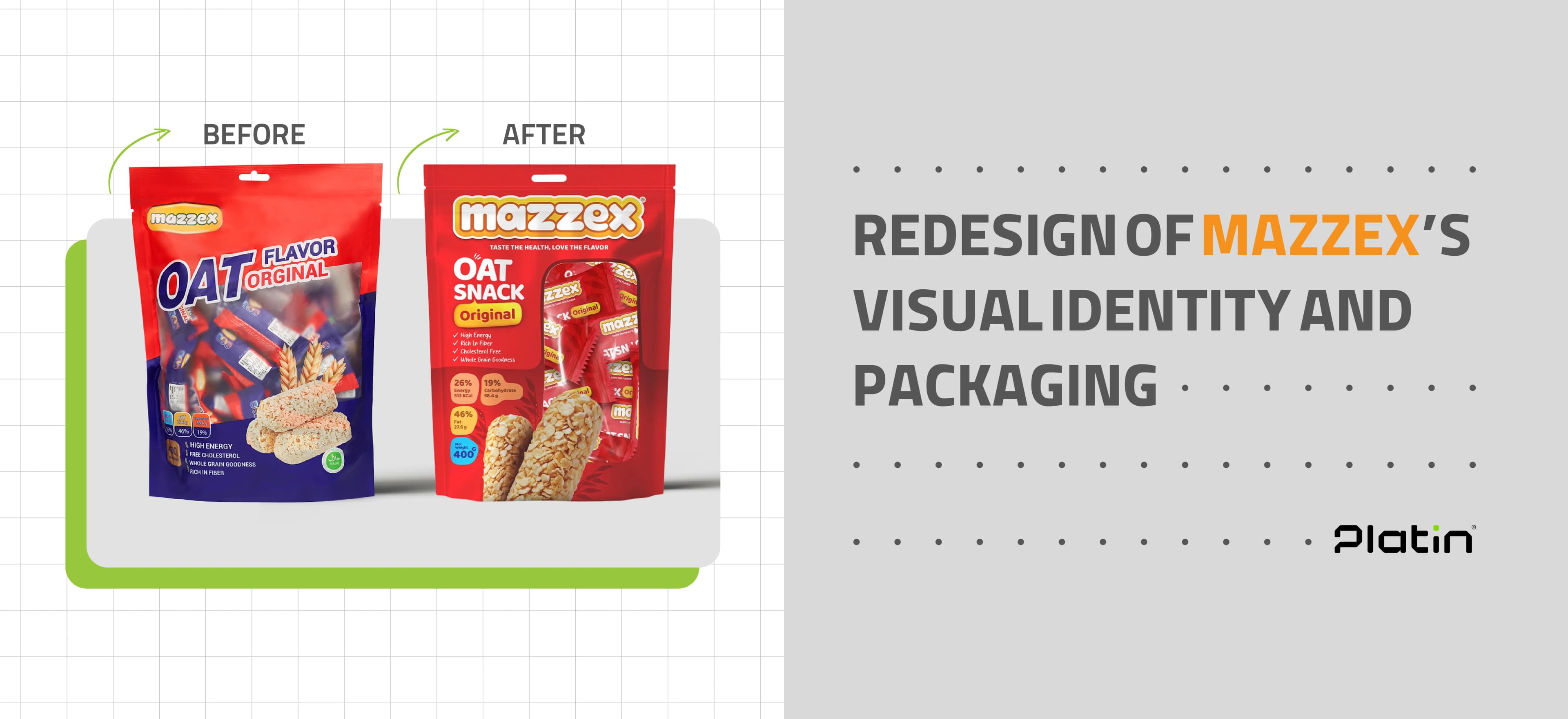
Mazzex, a brand specializing in healthy oat-based snacks, partnered with Platin Agency to introduce its new product line to the market. One of the brand’s main requirements was to design packaging that would stand out clearly on store shelves while communicating the product’s authenticity to consumers. This was particularly crucial because, in the previous packaging design, the brand name “Mazzex” was not given enough prominence. Instead, the word “OAT” was displayed in large, bold lettering, which created opportunities for unauthorized producers to misuse the term and flood the market with counterfeit products leveraging the “OAT” label, undermining Mazzex’s brand integrity.
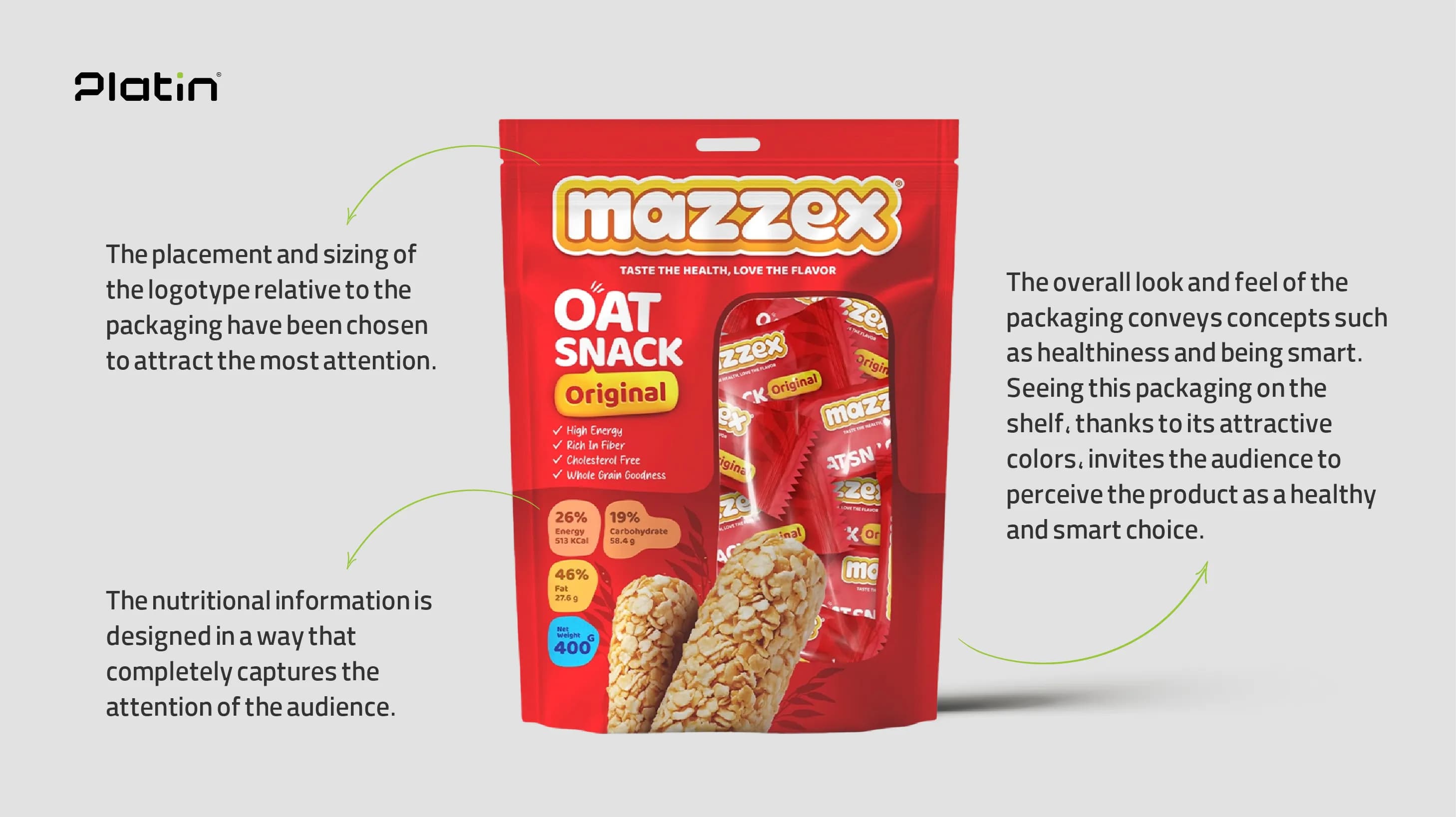
Research and InsightsExtensive research revealed the core qualities of the Mazzex brand: its products are natural, energizing, and healthy. In addition, the concept of “enthusiasm” was identified as a defining element of the brand’s identity. Audience analysis further showed that consumers want to clearly see what is inside the packaging. Product information is highly important to them — particularly details about fat content, ingredients, and other nutritional attributes. Consumers also expect the product name to be highly visible and prominently placed on the packaging for easy recognition.
StrategyThe main strategy was to ensure that the packaging would stand out on crowded store shelves and immediately draw customers’ attention. It was also clear that the “Mazzex” brand name needed to be far more prominent to strengthen consumer trust and brand recognition. Therefore, the final design prioritized making the “Mazzex” logo more noticeable while reducing the size of the “OAT” word, which had previously overshadowed the brand name. Given the product’s healthy nature, which might not automatically spark excitement at first glance, we decided to incorporate a dynamic and energetic concept into the visual identity to attract consumers more effectively.
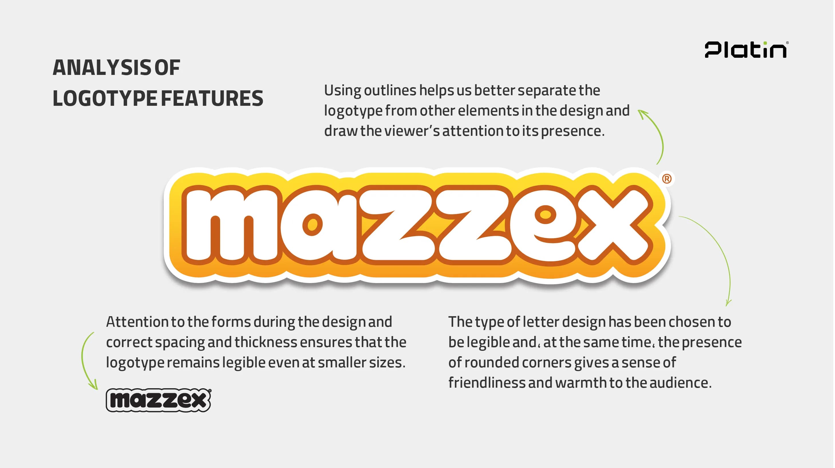
To convey energy, excitement, and health, yellow, orange, and white were selected as the brand’s primary colors. These colors not only represent vitality and well-being but also align perfectly with Mazzex’s brand personality. The redesigned logo emphasizes readability and recognizability, ensuring the authentic Mazzex product stands out from potential counterfeits. To strengthen consumer connection and enhance visual appeal, rounded and modern typefaces were chosen, adding a friendly and contemporary feel to the overall design.
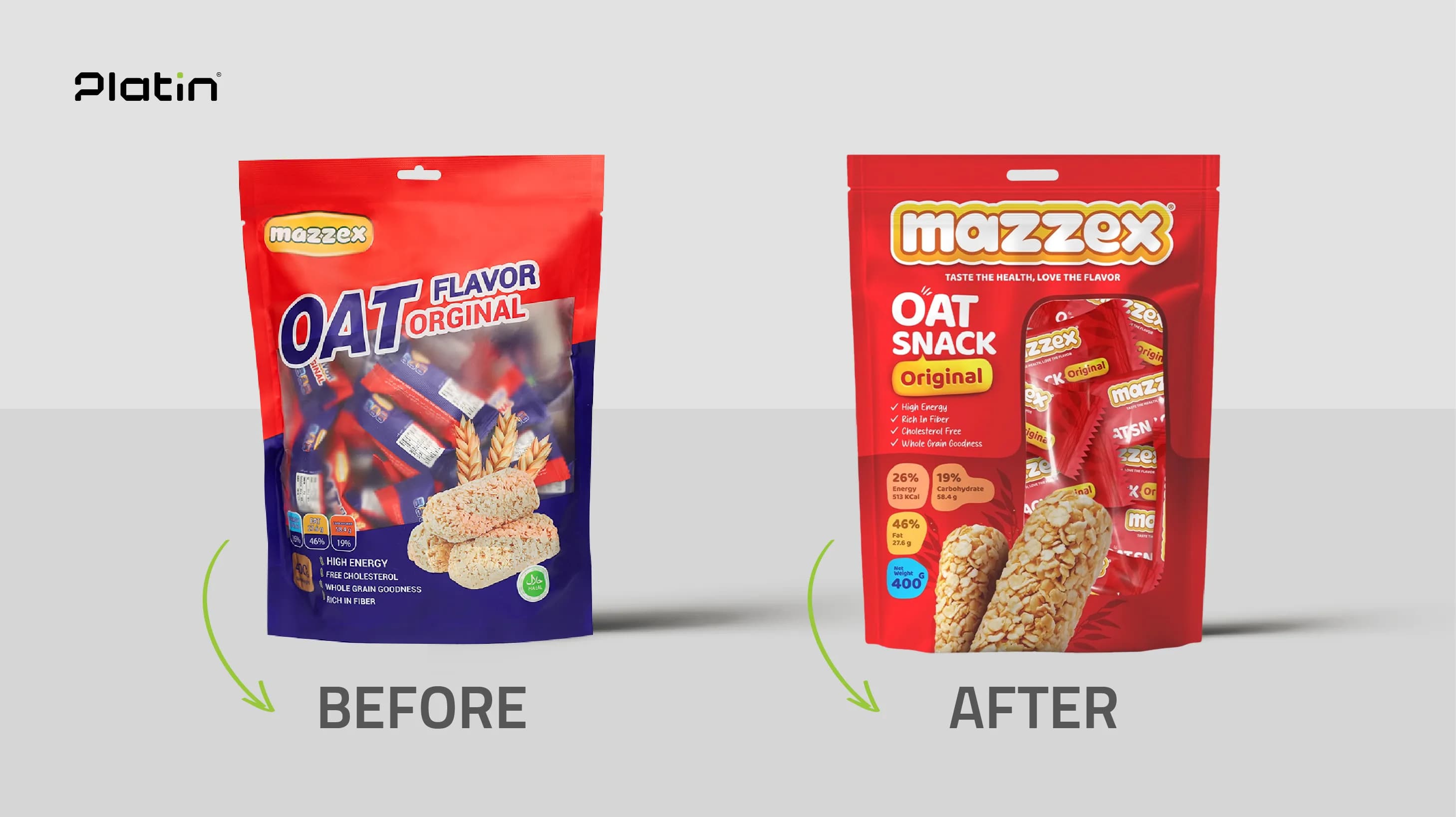
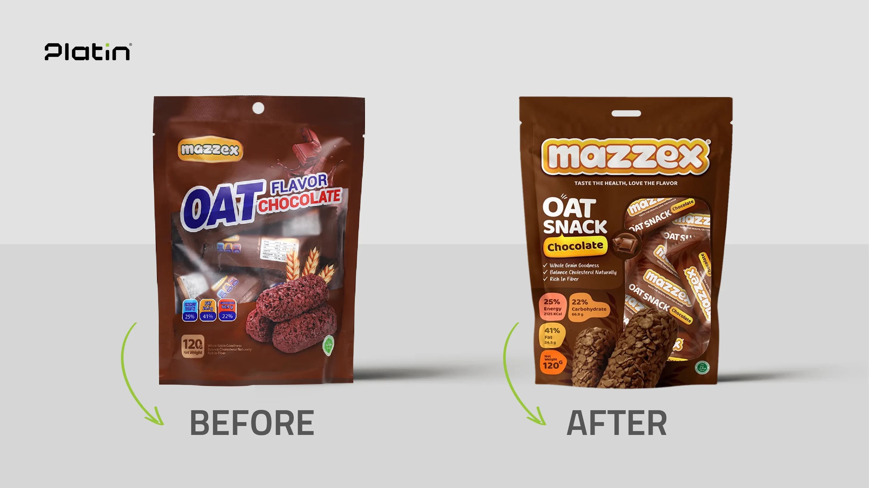
The new packaging prominently displays the Mazzex brand name, helping consumers instantly verify product authenticity. Reflecting the research findings, a transparent window was added so buyers can see the product inside. Each variant’s name and key information, such as ingredients and weight, are clearly printed in order of priority. Additionally, the packaging color palette was tailored to match each flavor, highlighting each product’s unique features while maintaining overall brand consistency.


Today, Mazzex products benefit from a cohesive yet distinctive visual identity that preserves the individuality of each product line. The redesign has made it easier for consumers to identify genuine Mazzex products and has strengthened the perception of authenticity and premium quality. By updating the packaging and prominently featuring the “Mazzex” name, the brand has significantly reduced the risk of unauthorized producers misusing the “OAT” label and has limited the spread of low-quality imitations.
The result is packaging that is clear, simple, and visually compelling — boosting consumer trust and creating an immediate link between the product’s appearance and its core values. This visual upgrade is designed to strengthen the brand’s competitiveness and set it apart from rivals. As a result, Mazzex’s new packaging now stands out effectively on store shelves, attracts more attention, builds stronger consumer trust, and drives higher sales for the brand.