 Case Studies
Return to Case StudiesTandis Construction Group Visual Identity Redesign
Introduction
In the dynamic world of architecture and construction, a brand’s visual identity plays a foundational role in expressing its essence, values, and market positioning. As a pioneer in developing residential buildings, modern towers, and landmark commercial complexes, Tandis Construction Group needed a visual identity capable of reflecting the grandeur, strength, and innovation embedded in its projects.
This vision was realized through a meticulous and creative redesign process led by the expert team at Platin Advertising Agency.
This case study outlines the key stages of this design journey—showing how visual elements, from the logo to the color palette, were crafted to embody the spirit of the Tandis brand in a distinct and contemporary form.
From Idea to Creation: Platin’s Key Challenges
Platin began the redesign process with the brand strategy slogan “A Unique legacy.” The main challenge was transforming this abstract concept of legacy into a meaningful and impactful visual language.
The team first examined iconic global brands such as Rolex and Patek Philippe, both of which have successfully embedded legacy and timelessness into their visual identities.
Yet an important contrast emerged: these brands rely heavily on classical aesthetics, while Tandis embraces a modern and contemporary approach.
This divergence prompted deeper research into Iranian art, culture, and architectural history. During this exploration, Achaemenid architecture—particularly Persepolis—became the core source of inspiration.
The monumental and symmetrical stone blocks of Persepolis represented both enduring strength and a naturally minimal, geometric structure—attributes that perfectly aligned with the Tandis brand.
This insight opened a new path for the brand strategy and visual identity development process, enabling Platin’s design team to create an identity where historical grandeur and cultural authenticity are presented through a modern and global design language.
The outcome was a visual identity that embodies both the richness of Iranian heritage and the innovative mindset of Tandis in modern construction.
Platin’s Design Strategy: Crafting a Symbol of Enduring Legacy
The breakthrough moment for the design team came from recognizing the symbolic value of the Persepolis stone blocks—the very components that, despite the invasion of Alexander and the catastrophic fires, remained standing for millennia.
This quality resonated deeply with Tandis’ core concept of a “lasting legacy.”
Thus, these stone blocks were chosen as the primary motif of the visual identity. They were minimal, geometric, and at the same time, powerfully expressive of strength and heritage.
The initial idea centered on simple square forms.
But another essential element needed representation: the dynamic, ever-evolving nature of construction itself.
Buildings transform over time—from foundational blocks to monumental structures. This transformation inspired the team to merge the concepts into a single innovative idea:
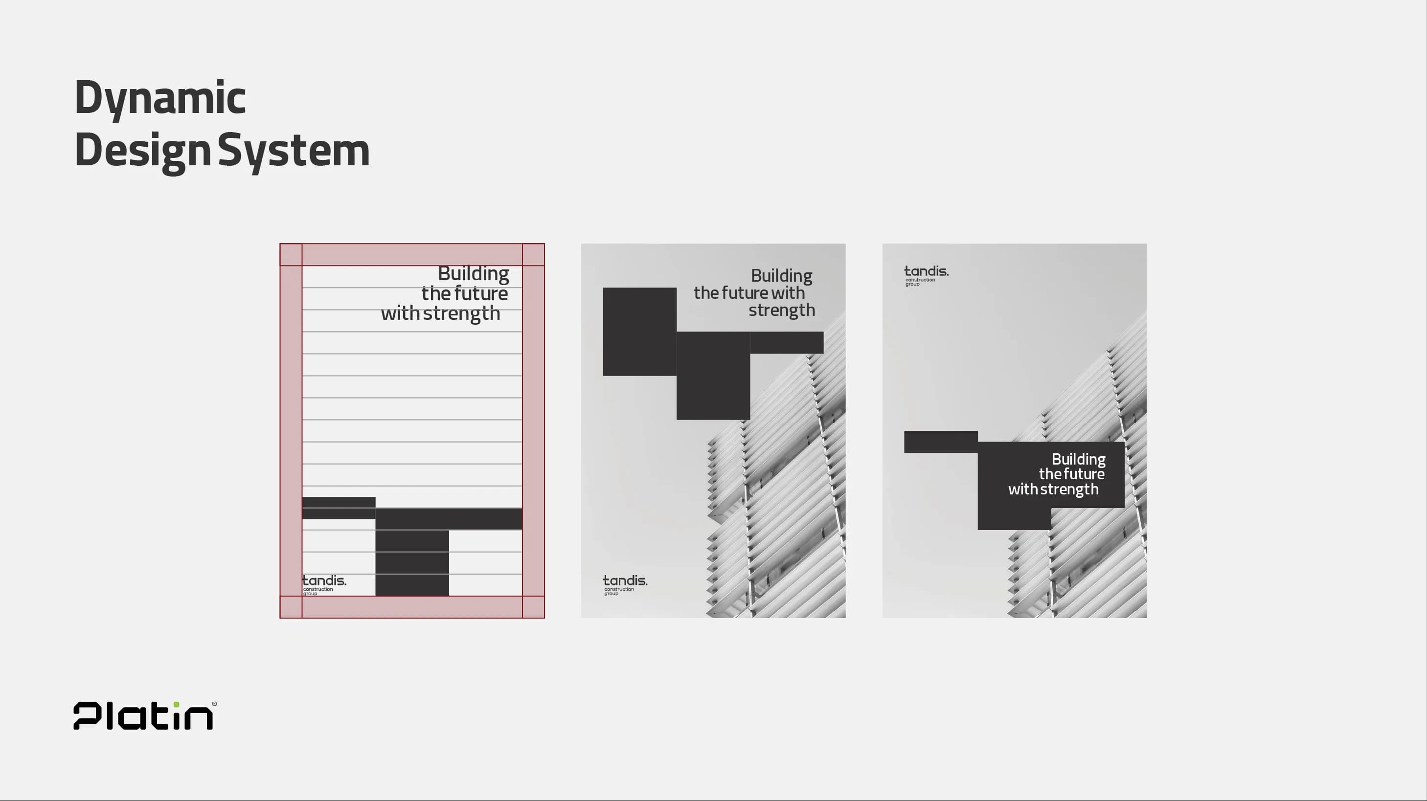
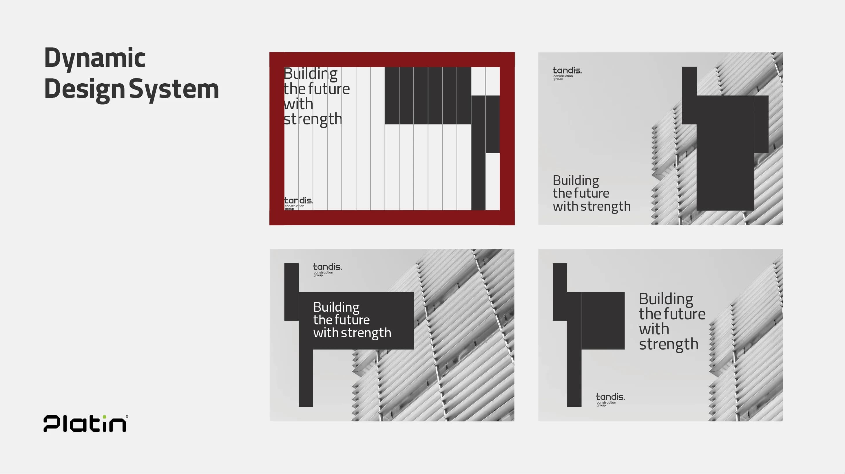
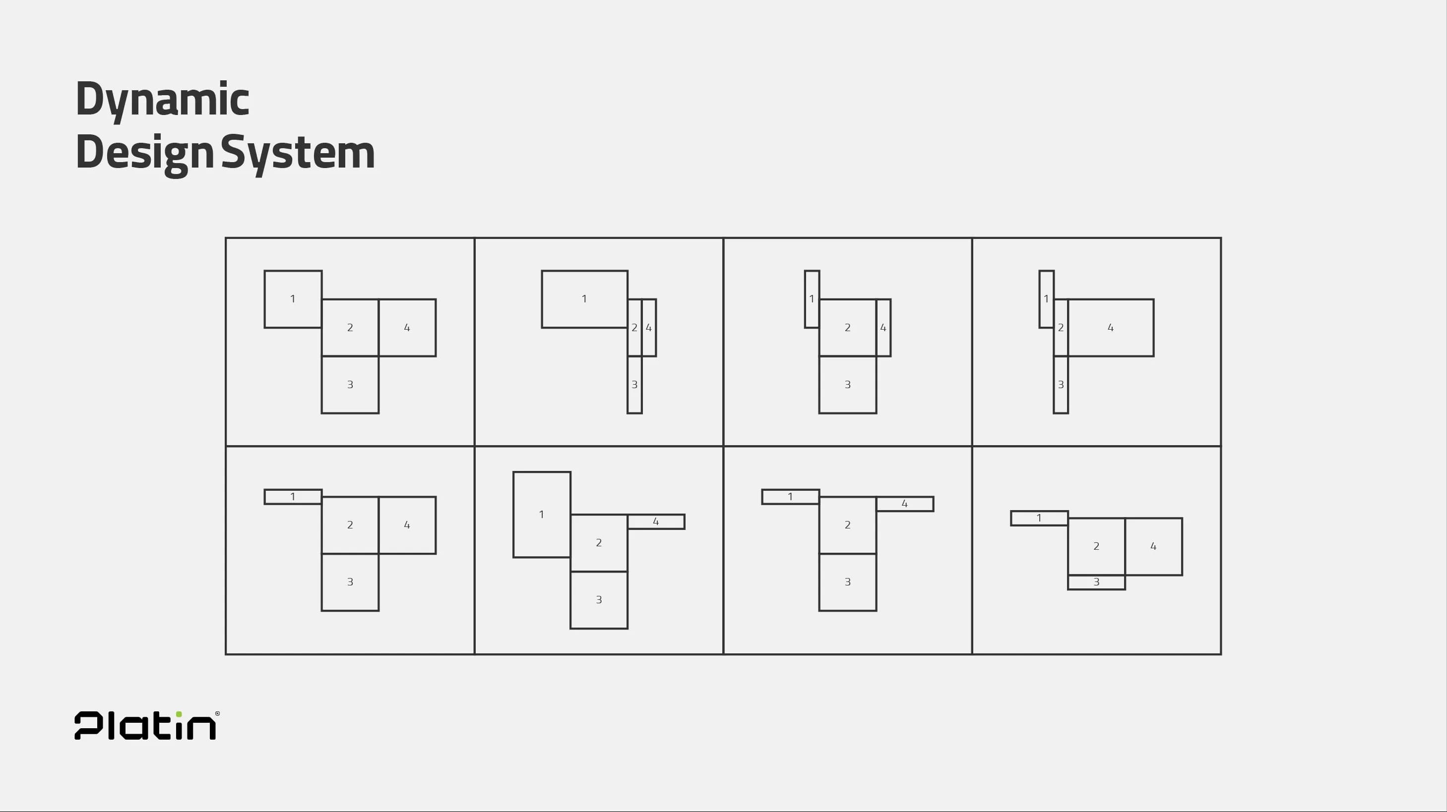
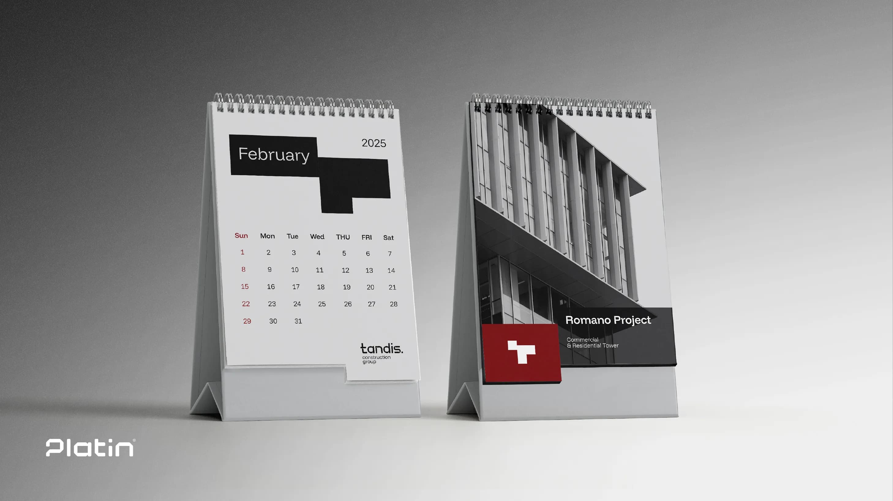
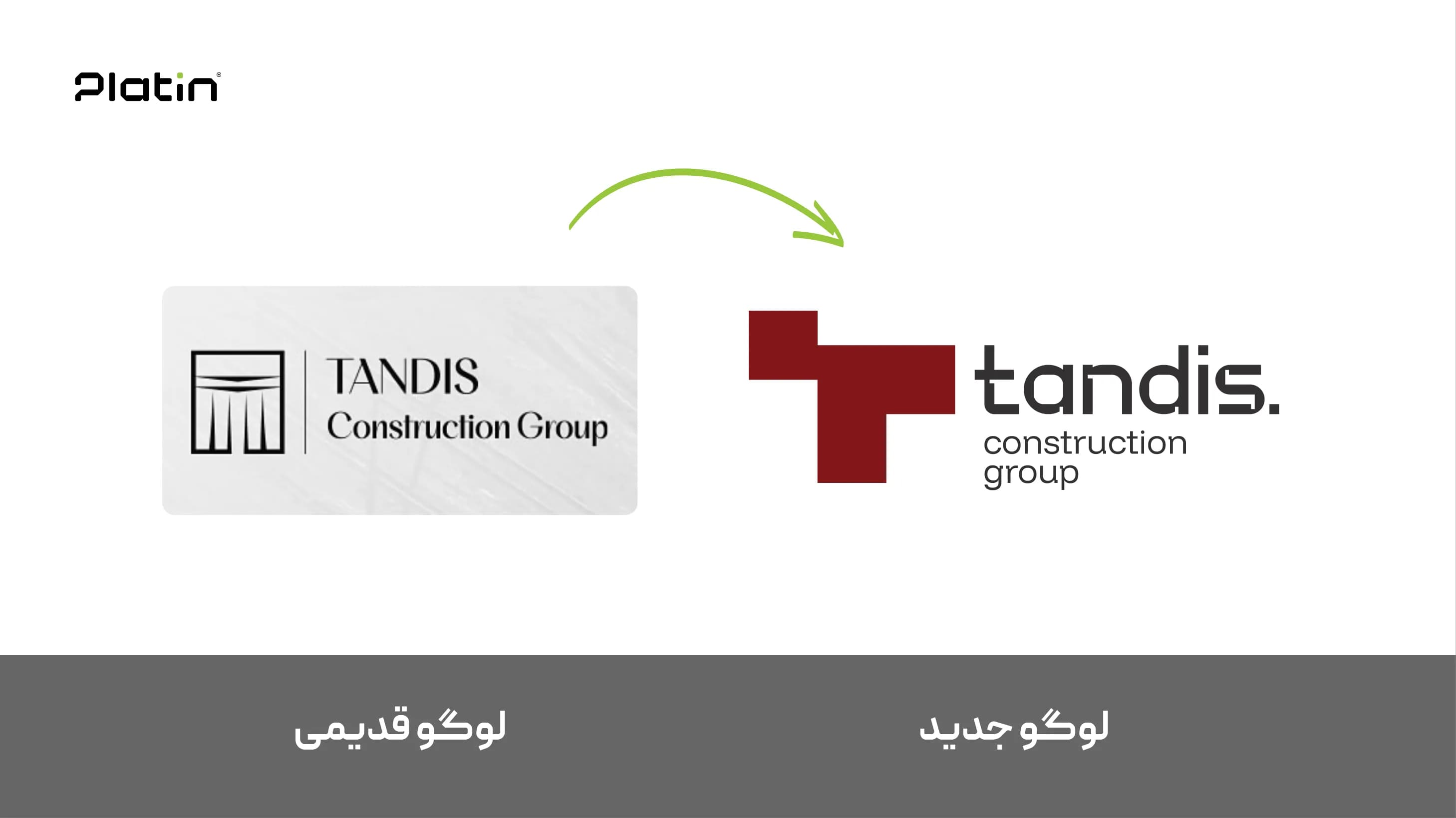
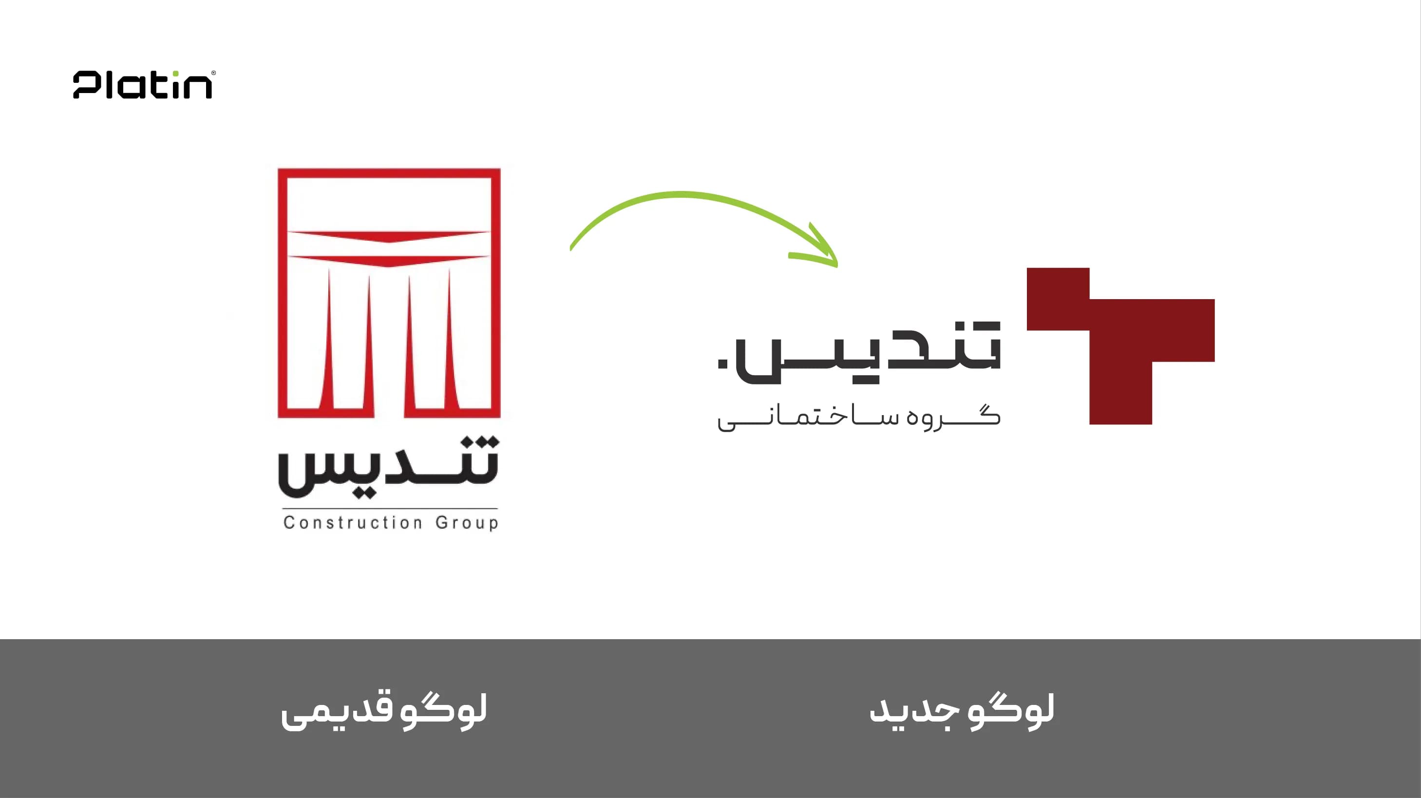
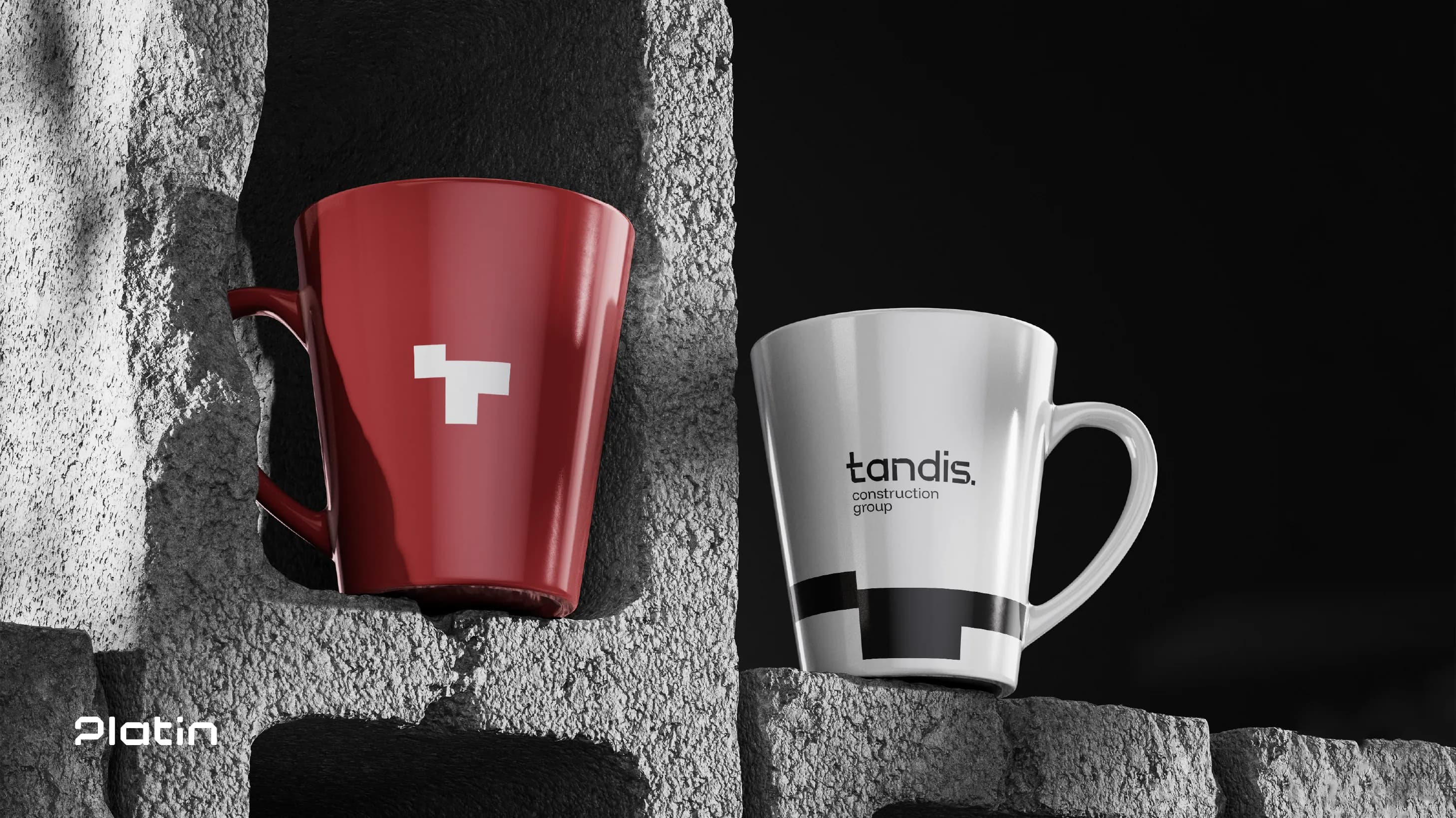
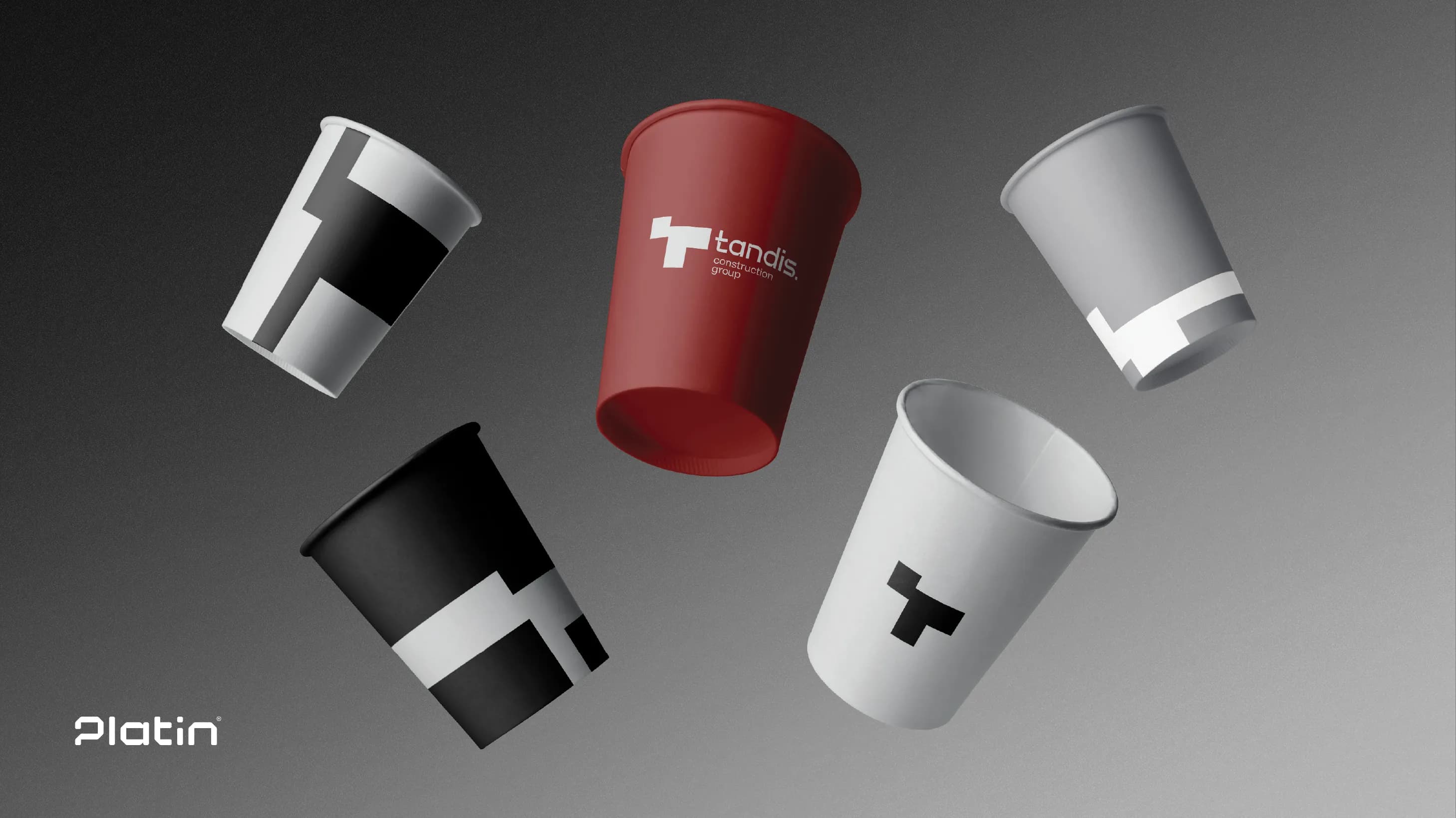
A dynamic logo based on the letter “T,” formed by four modular square blocks.
These blocks do not remain static; they rearrange themselves across brand applications, forming a responsive system that can adapt to various contexts while maintaining a consistent core identity.
This dynamic system gives the Tandis visual identity both timeless stability and flexible expressiveness, allowing the brand to narrate a story of evolution, innovation, and lasting heritage—all at once.
The Challenge of Choosing the Right Color Palette
The color palette development began with one specific requirement from the client: the use of red.
While this could initially seem restrictive, it quickly became an opportunity for creative innovation.
The key question was:
How can the color red express modernity, luxury, and a sense of enduring heritage simultaneously?
Platin’s creative team approached the challenge by constructing a core palette of three main colors: red, black, and white.
- Red — symbol of power, authenticity, and distinction
- Black — representing authority, durability, and premium aesthetics
- White — creating visual balance, clarity, and modern minimalism
Together, these colors formed a bold and elegant system that captures the brand’s essence.
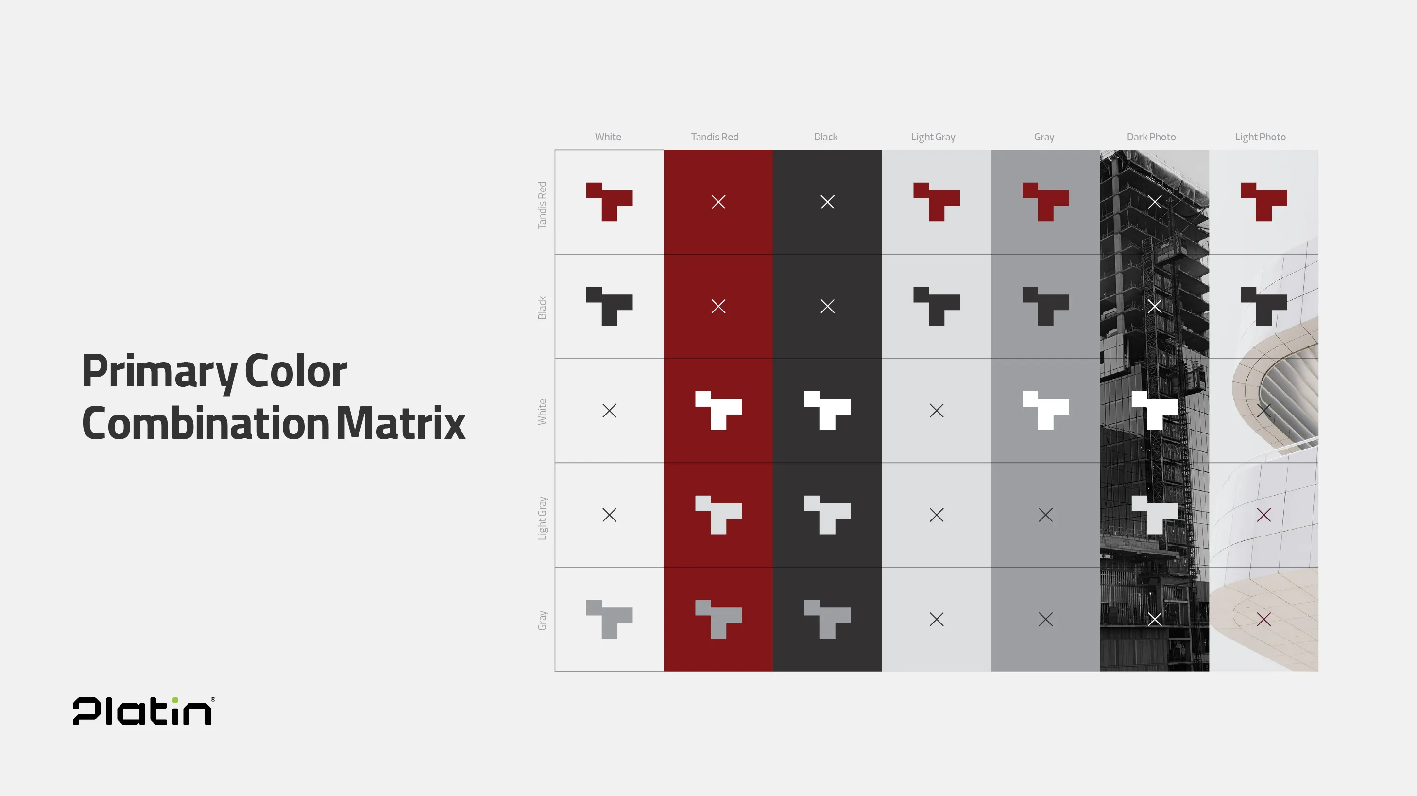
But the story didn’t end there. Considering Tandis’ future as a potential multi-division holding, Platin developed a smart secondary palette.
In this system:
- Red remains the primary color and signature of the holding,
- while four complementary colors can be assigned to future sub-brands (e.g., design department, contracting division, etc.).
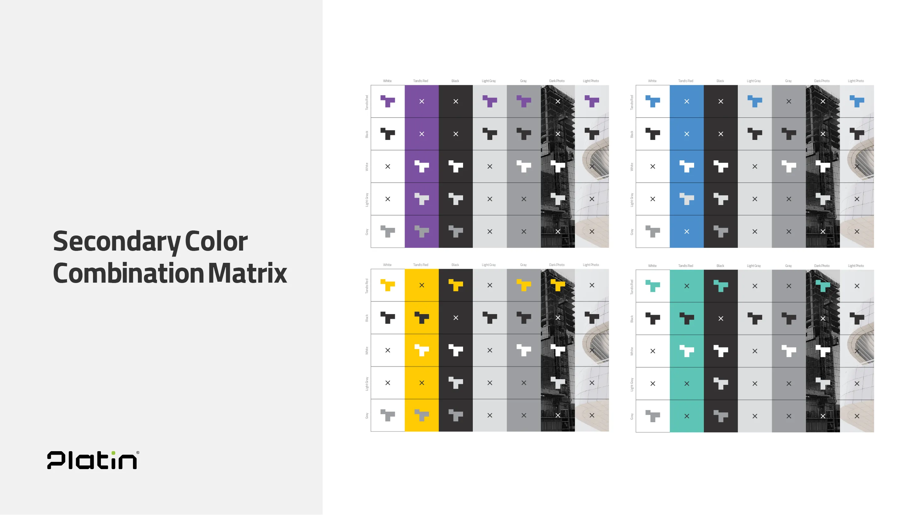
This approach ensures that each sub-brand maintains a distinct visual personality while staying perfectly aligned with the core Tandis brand.
The final palette not only met the initial requirement but also established a scalable, architecture-ready color system for future brand expansion.
Platin’s Holistic Perspective in Brand Strategy Implementation
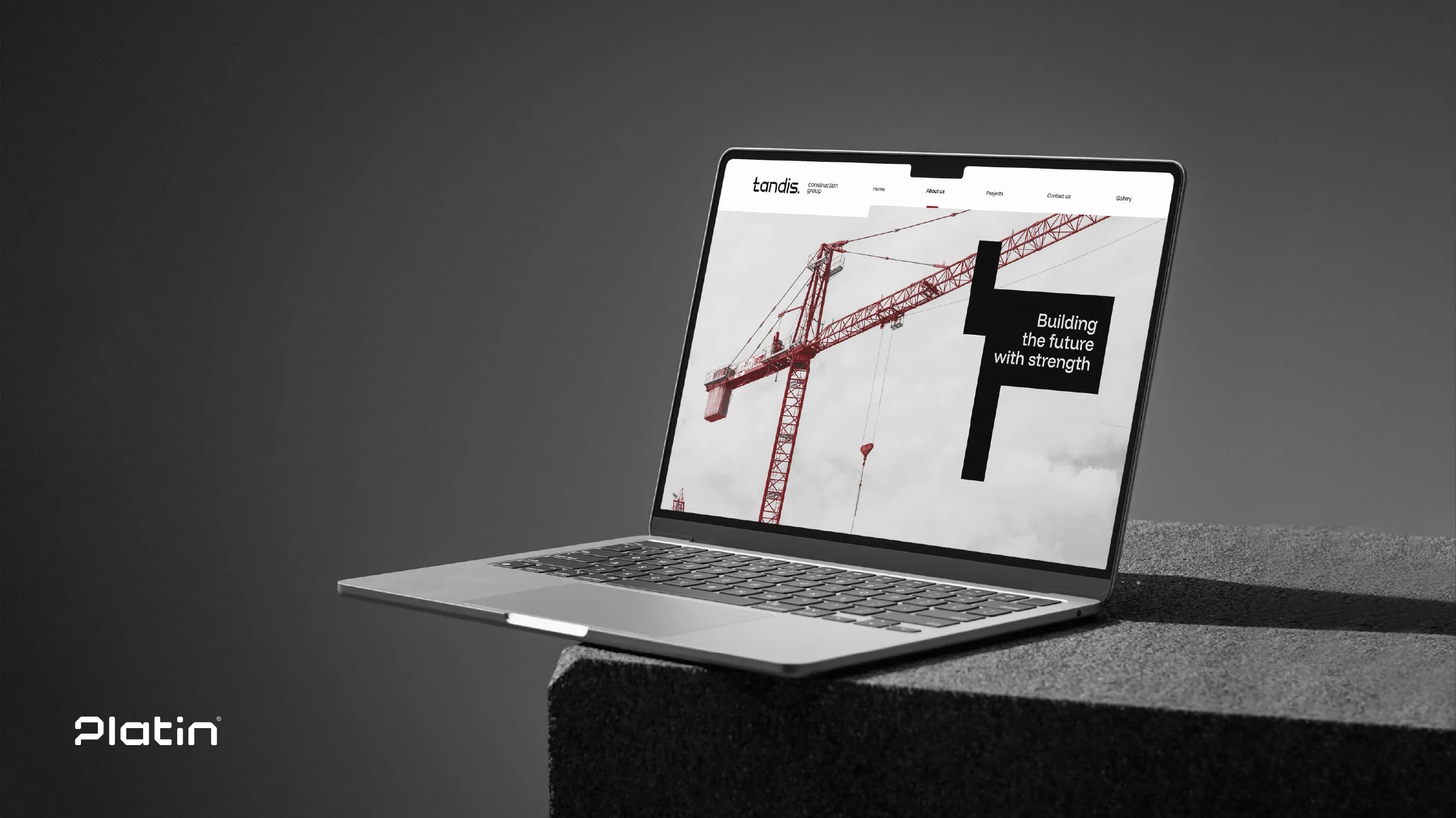
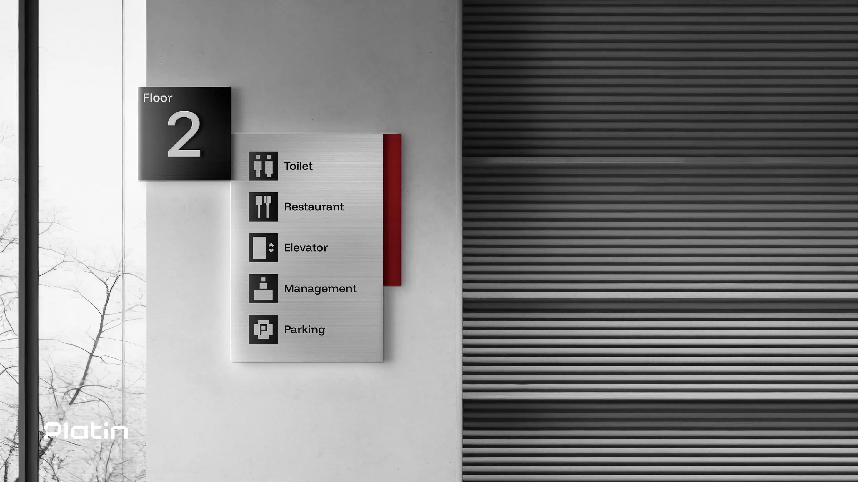
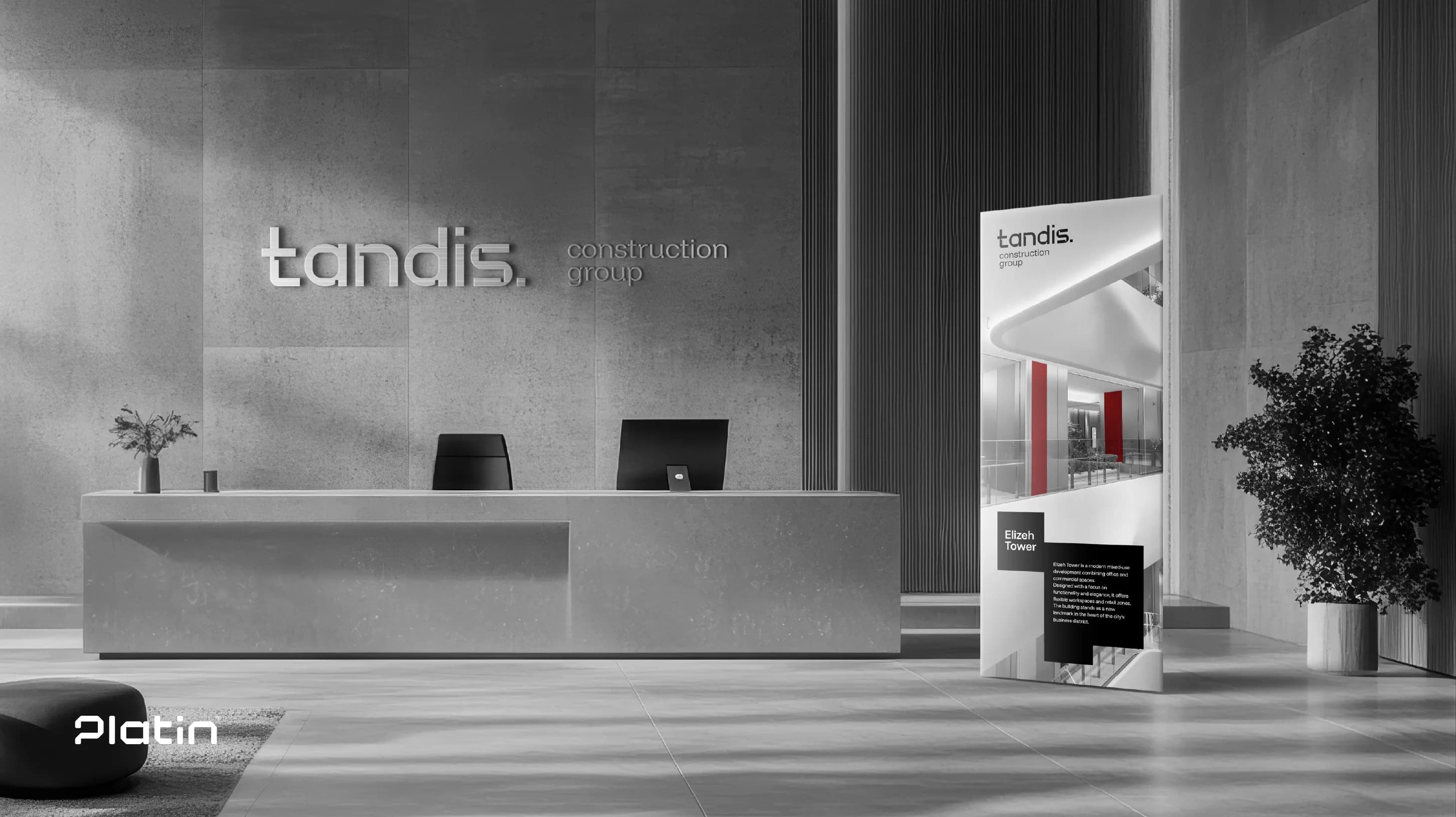
The execution of the Tandis branding strategy took shape through a comprehensive and detail-oriented approach to every customer touchpoint.
From the earliest steps to the final rollout, Platin crafted a coherent visual experience grounded in consistency and precision.
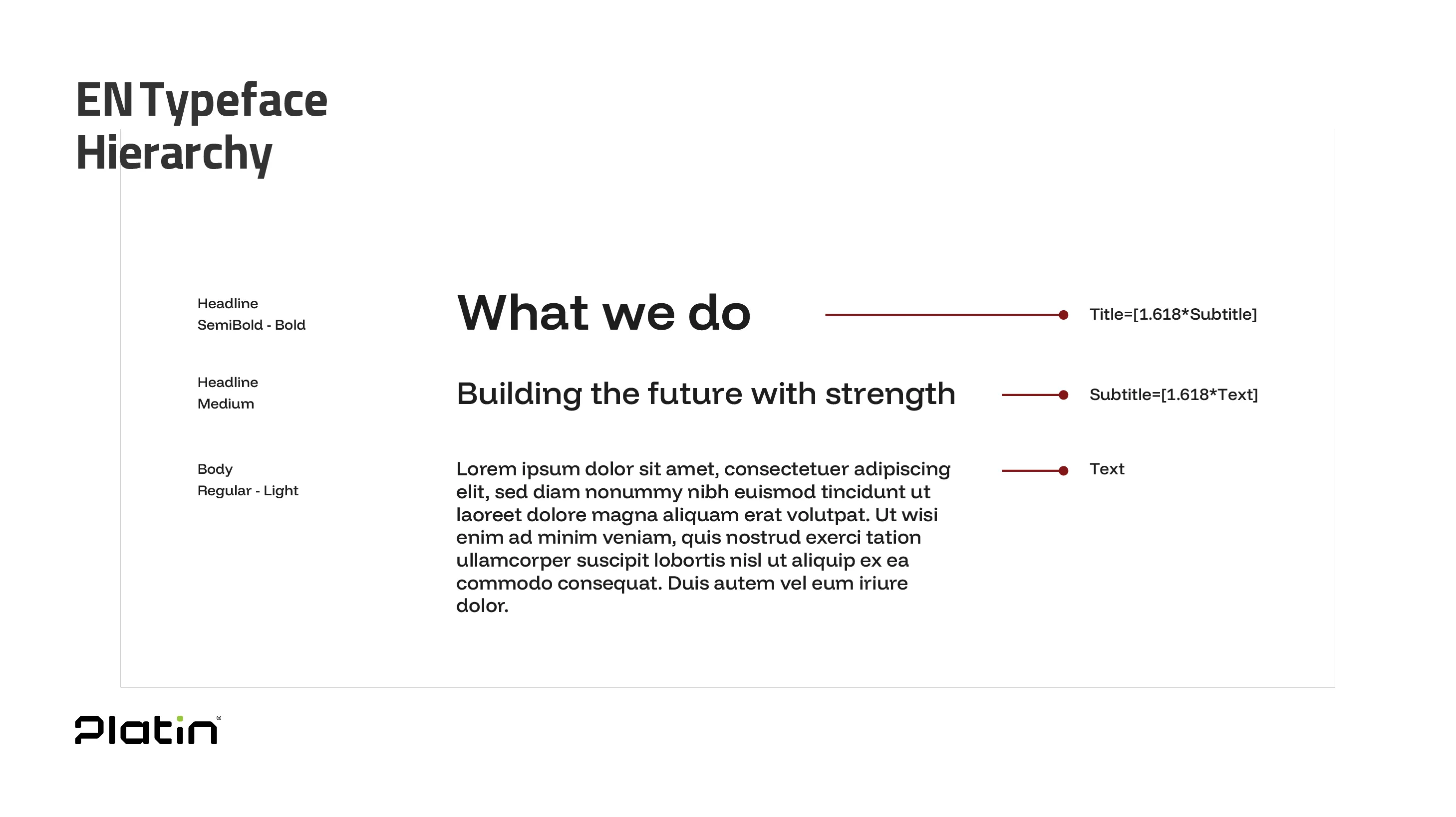 This included:
- an engineered, contemporary logo system
- carefully selected Persian and Latin typefaces
- a purposeful and cohesive color palette
- unified advertising elements and brand assets
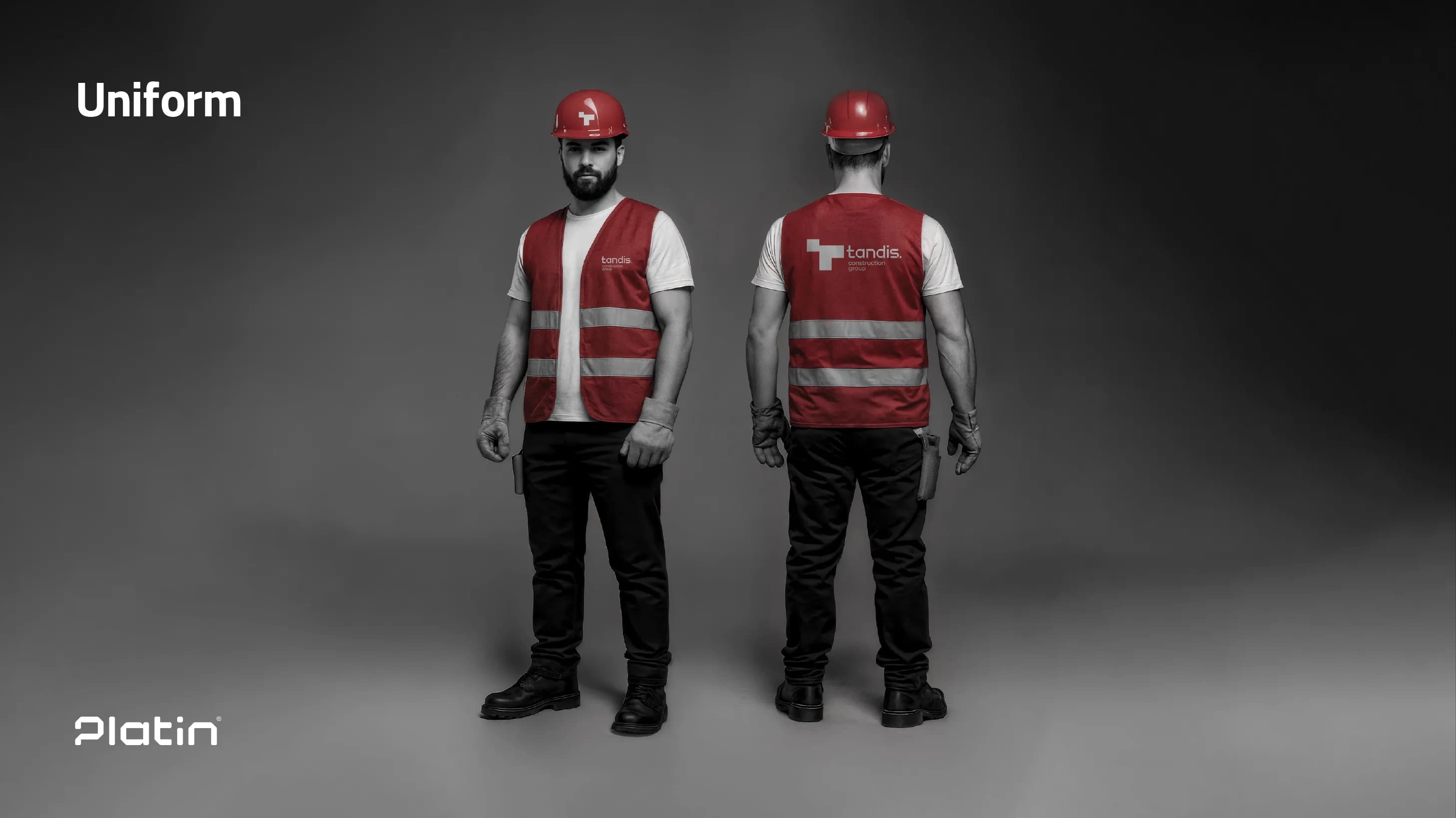
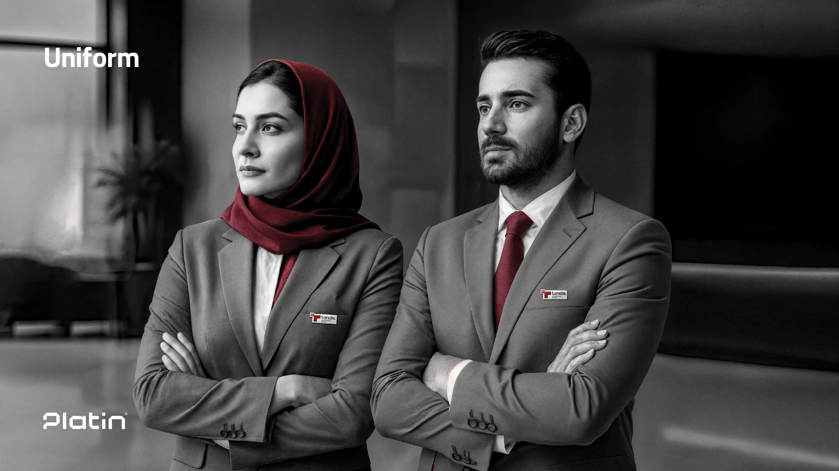

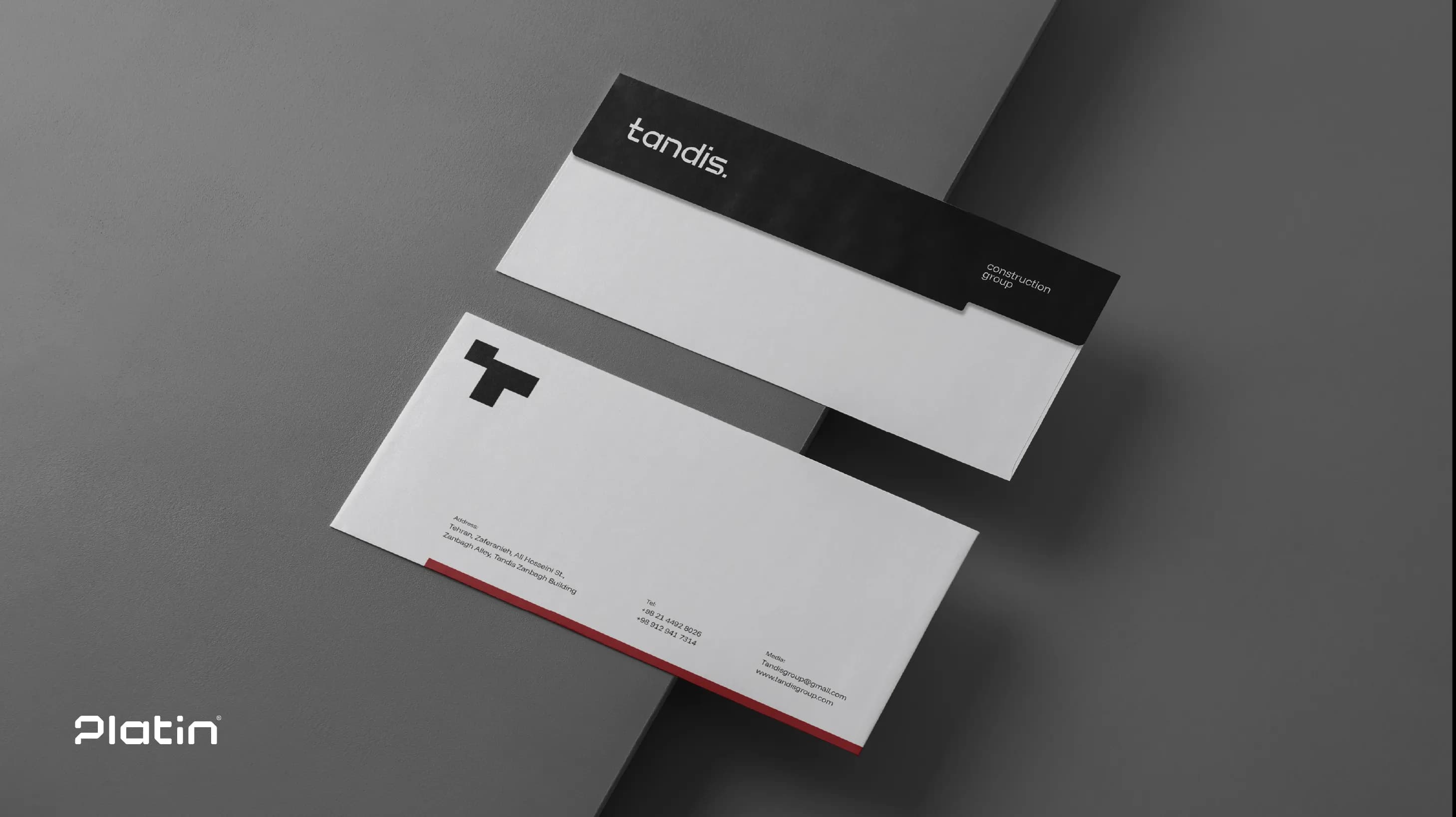
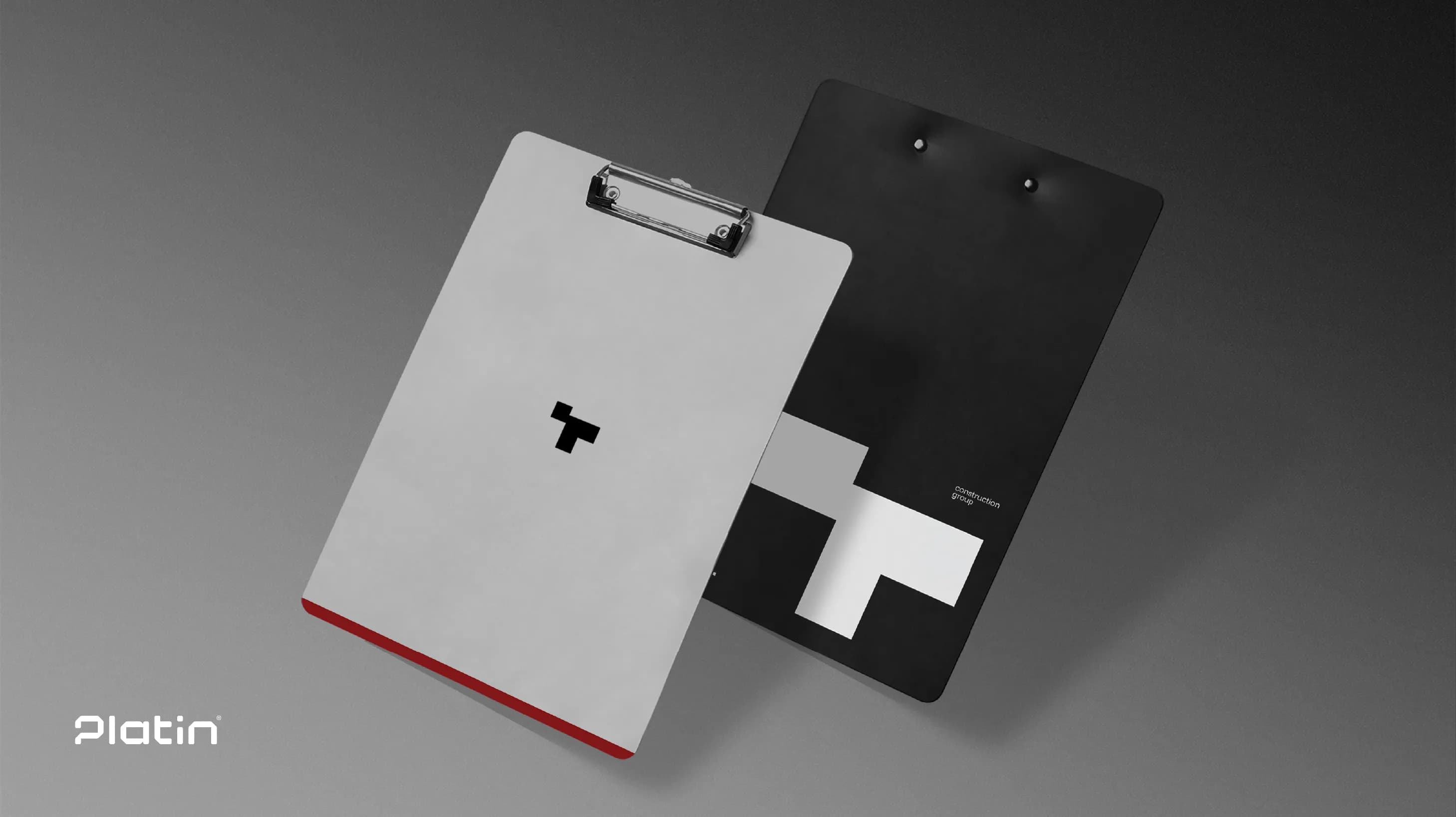
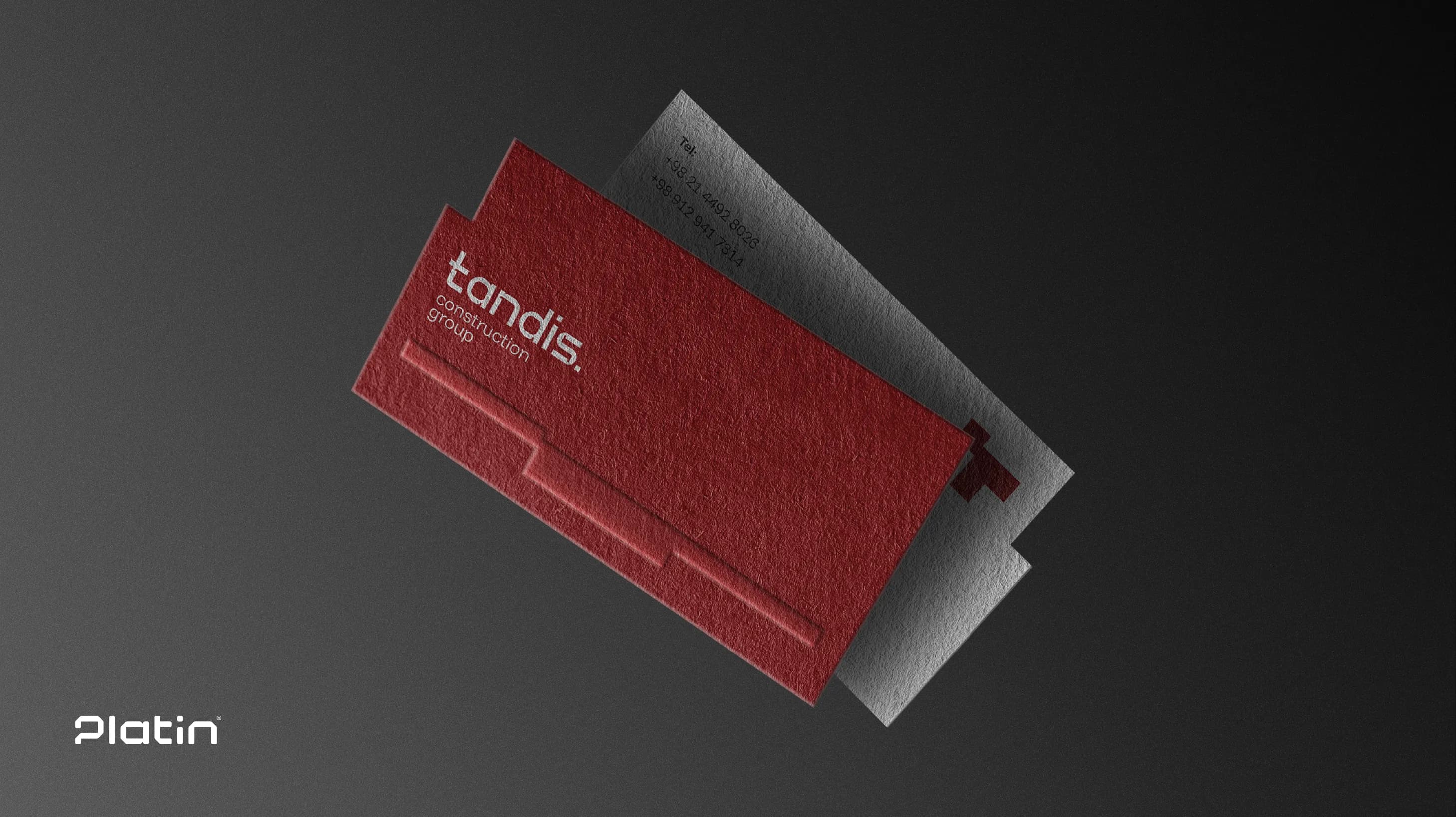
reflecting the same visual DNA.
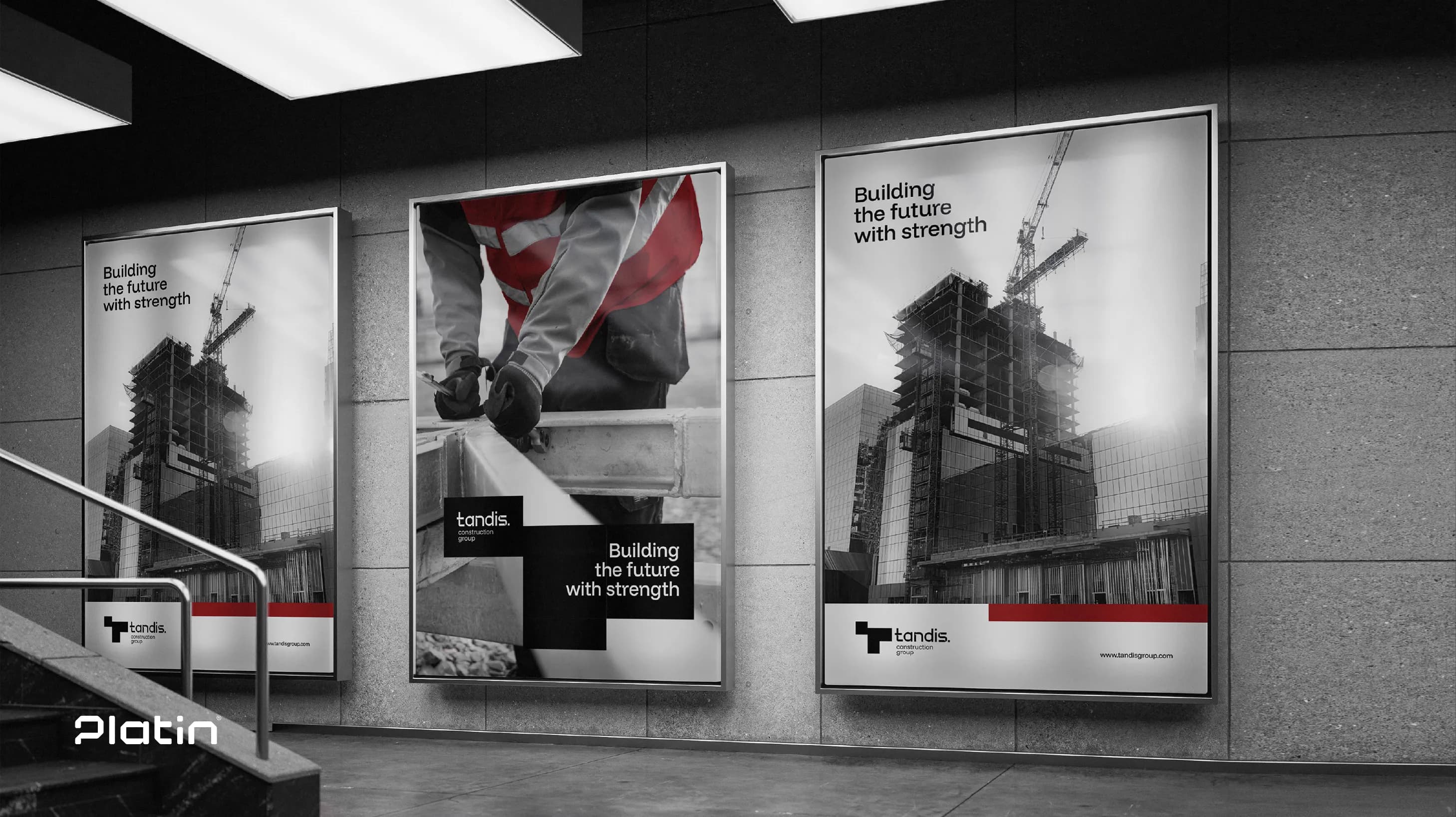
Even the interior architecture of Tandis’ office was shaped using elements extracted from the new visual identity.
Attention to detail at every stage reflects Platin’s commitment to building a unified visual experience.
The result is a visual identity where every touchpoint becomes part of a continuous narrative—one that reinforces the strength, permanence, and authenticity of the Tandis brand.
Conclusion
The visual identity of Tandis Construction Group is the result of a strategic and creative process led by Platin Agency.
Inspired by the enduring architecture of the Achaemenid Empire and the stone blocks of Persepolis, the core design was shaped around themes of strength, heritage, and modern craftsmanship.
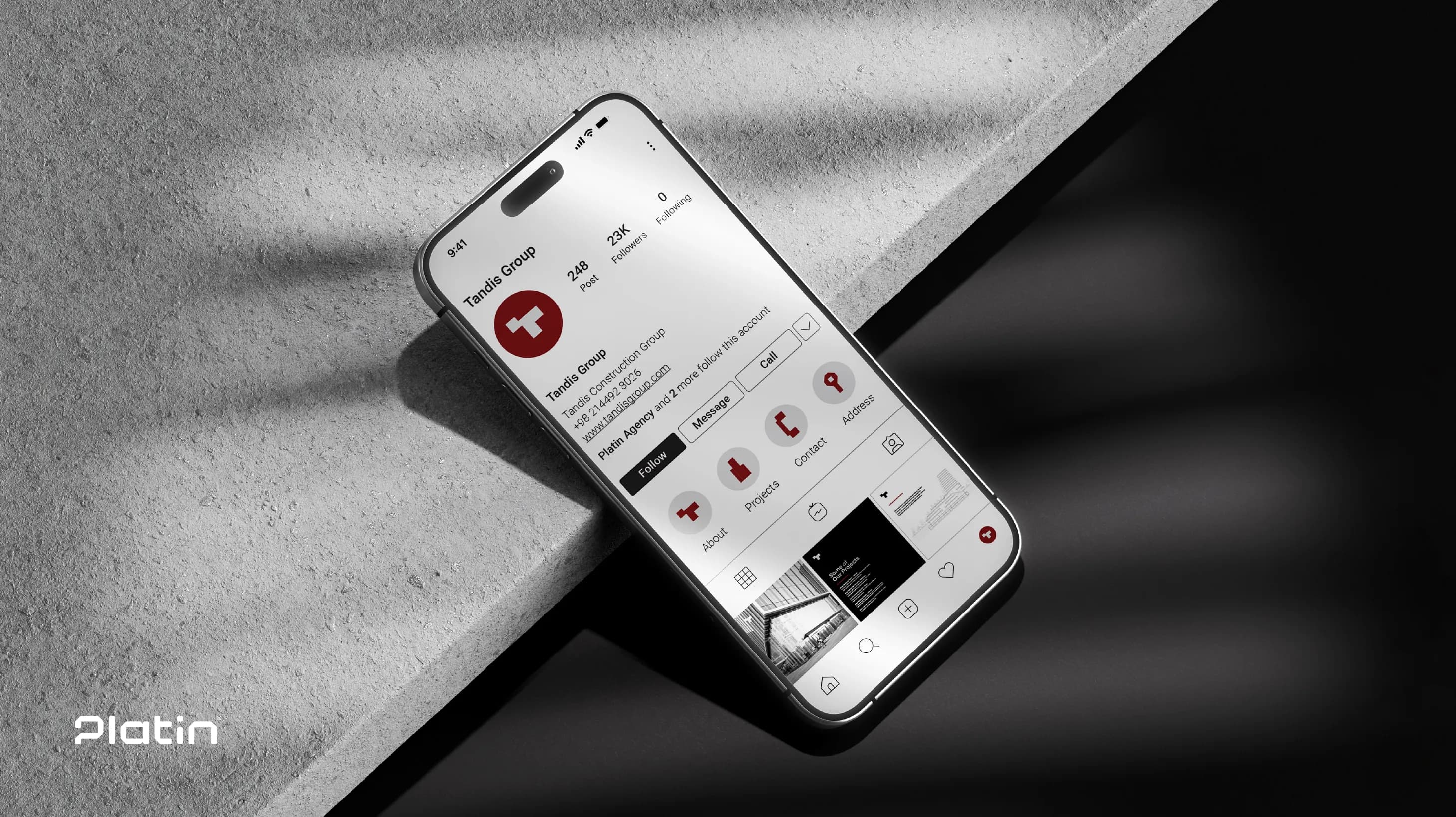
Through a dynamic visual system, an intelligent color strategy, and flexible graphic elements, Platin created an identity that is both cohesive and versatile—visible consistently across all brand touchpoints, from the logo and website to interior design.
This project not only solidified Tandis’ position as a leader in the construction industry but also established a lasting symbol that harmoniously blends authentic Iranian architectural heritage with contemporary design approaches.
For more details or to consult with Platin’s sales and brand strategy team, feel free to get in touch.
