

 Case Studies
Zikerto is an Iranian personal care brand that focuses on active lifestyles and designs and produces products such as hair and body shampoo, sprays, and body splashes for active individuals. The brand aims to meet the needs of people who value health, physical activity, and the quality of personal care.
The Zikerto project was assigned to Platin Communications and Marketing Agency with the goal of designing the product packaging. However, from the very beginning, it became clear that this project was not merely a graphic design task. The packaging needed to help Zikerto clarify its brand positioning, engage a broader audience, and stand out on retail shelves.
Zikerto initially focused primarily on professional athletes. Although this focus could create brand differentiation in the short term, it would limit the audience range and reduce the potential for sales growth in the long term.
The main question was:
Is Zikerto only for professional athletes, or can it become a companion for everyone with an active lifestyle?
The answer to this question changed the direction of both the brand strategy and the packaging design.
Consumer behavior analysis showed that many people, although they do not consider themselves professional athletes, are physically active in their daily lives. Walking, cycling, yoga, badminton, light exercise, or even simply trying to maintain a healthier body are all part of an active lifestyle.
Accordingly, Zikerto’s audience expanded from a limited sports-focused group to a broader range of active individuals—people who value health, energy, and taking care of their bodies.
Based on the audience analysis, Platin’s strategy team arrived at a central concept:
“You Don’t Have to Be a Champion”
This idea helped Zikerto move beyond an exclusive focus on professional champions and connect with people who are on a path toward growth, health, and physical activity.
From this perspective, Zikerto’s audience was seen as uncut diamonds: valuable, unique, and still taking shape. This concept became the foundation for developing the brand’s visual identity and packaging design.
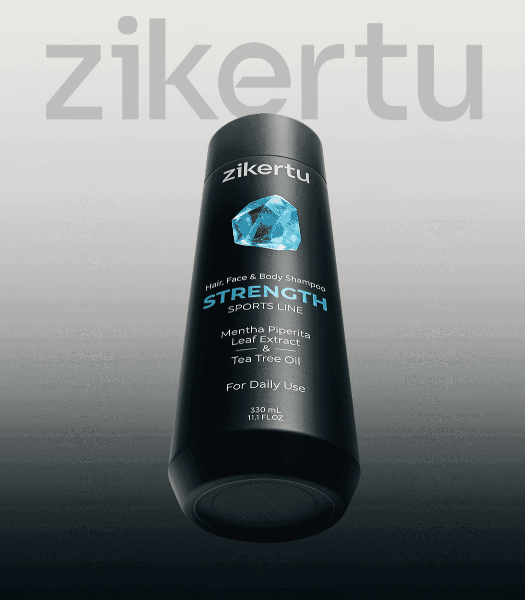
Zikerto’s visual language was developed around the concept of “uncut diamonds.” Four diamond-inspired elements in different colors were designed for the four product lines, allowing each line to have its own distinct identity while maintaining overall brand consistency.
This structure gave Zikerto a dynamic visual system—one that could be used across the current packaging and remain flexible enough for future product development.
The brand’s main product lines included:
Each line was introduced with a specific color and graphic element so that customers could identify their desired product more quickly at the point of purchase.
In the personal care market, packaging is one of the most important brand touchpoints. When customers encounter products on a retail shelf, they do not have much time to review every detail. Therefore, packaging must communicate the brand identity, product type, key benefit, and sense of quality within a few seconds.
The goal of Zikerto’s packaging design was not simply to make the product more visually appealing. The packaging needed to help the audience make faster decisions, differentiate the product from competitors, and present a more professional image of the brand.
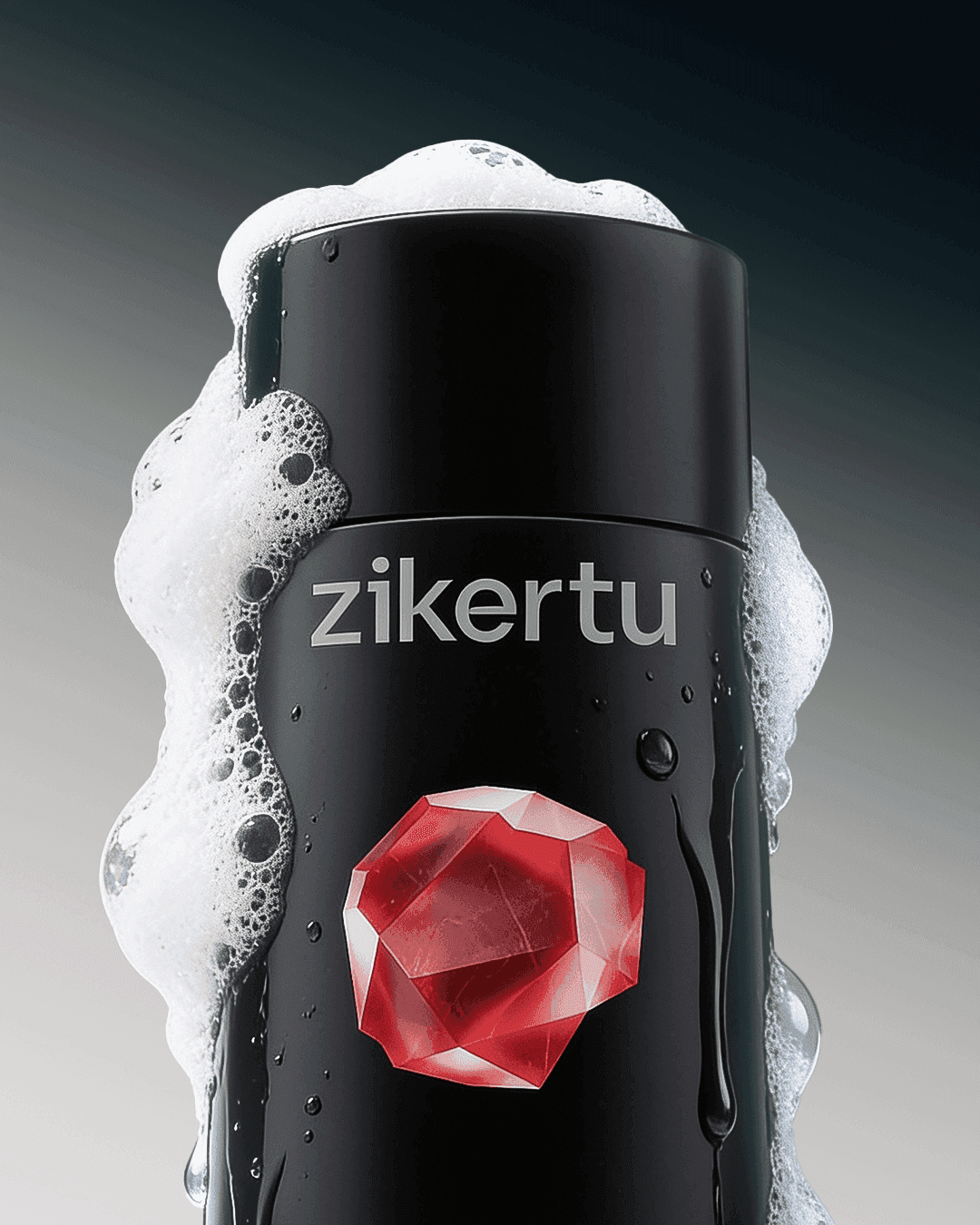
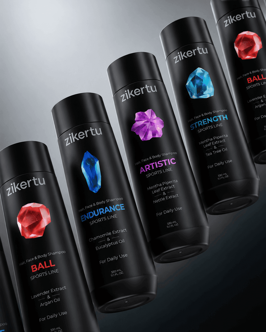
Black PET containers were selected for Zikerto’s products. The black color gave the brand a sense of strength, endurance, and quality, while also helping the products achieve a distinctive presence on retail shelves.
However, this choice also created a technical challenge. Producing and molding black containers in Iran is more difficult, and direct printing on them is costly. For this reason, instead of removing this choice, the Platin team developed a practical solution: using custom-designed transparent labels.
This solution preserved the professional and premium appearance of the packaging while keeping production and printing costs under control.

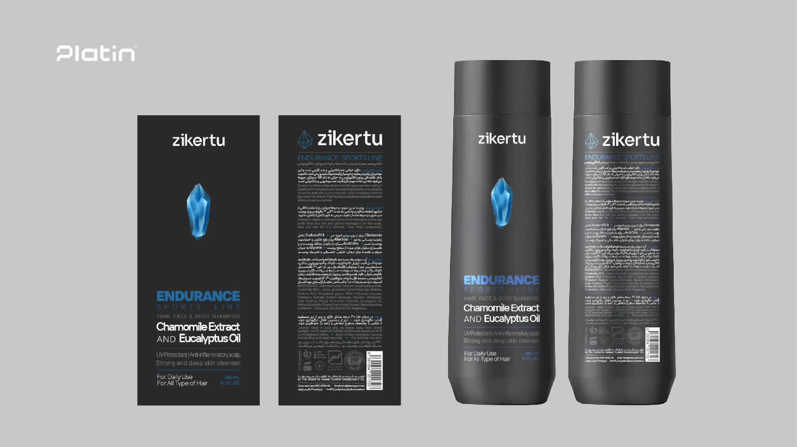
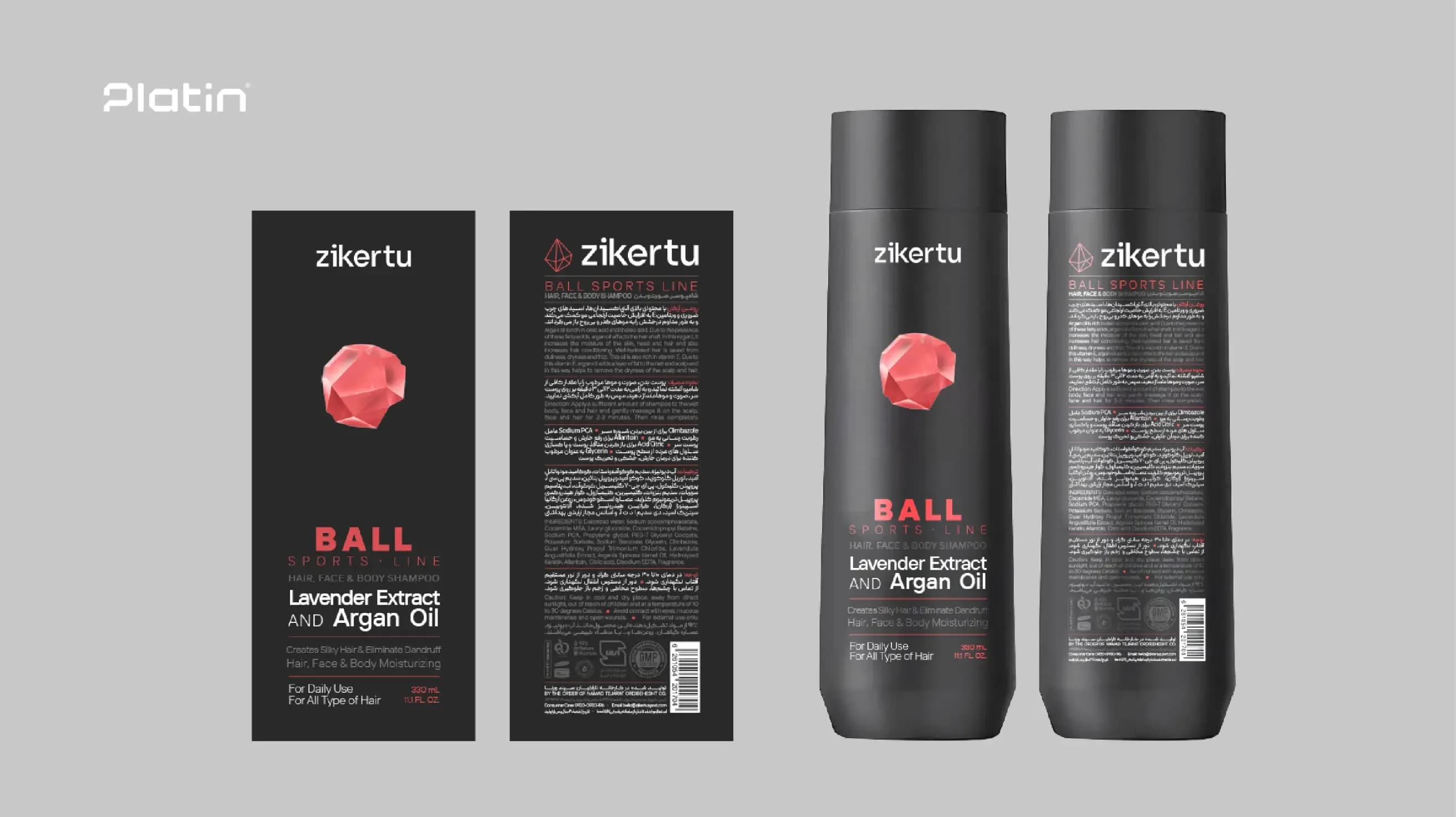
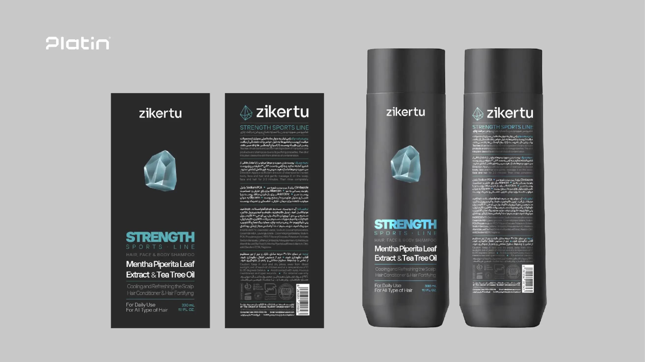
One of the key decisions in Zikerto’s packaging design was how to manage the volume of information on the label. At the moment of purchase, excessive information does not necessarily help customers make a choice and may instead cause confusion.
For this reason, the packaging information was organized according to priority. Details such as product type, application, key feature, fragrance, and main benefit were placed in highly visible areas, while personal care information such as ingredients, usage instructions, and expiration date was presented in a clear, organized, and readable structure.
This approach made the packaging visually cleaner and more professional while still responding to the audience’s informational needs.
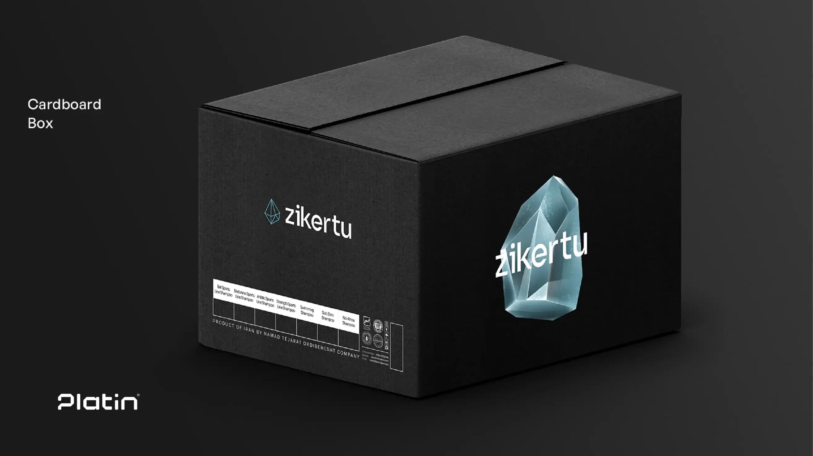
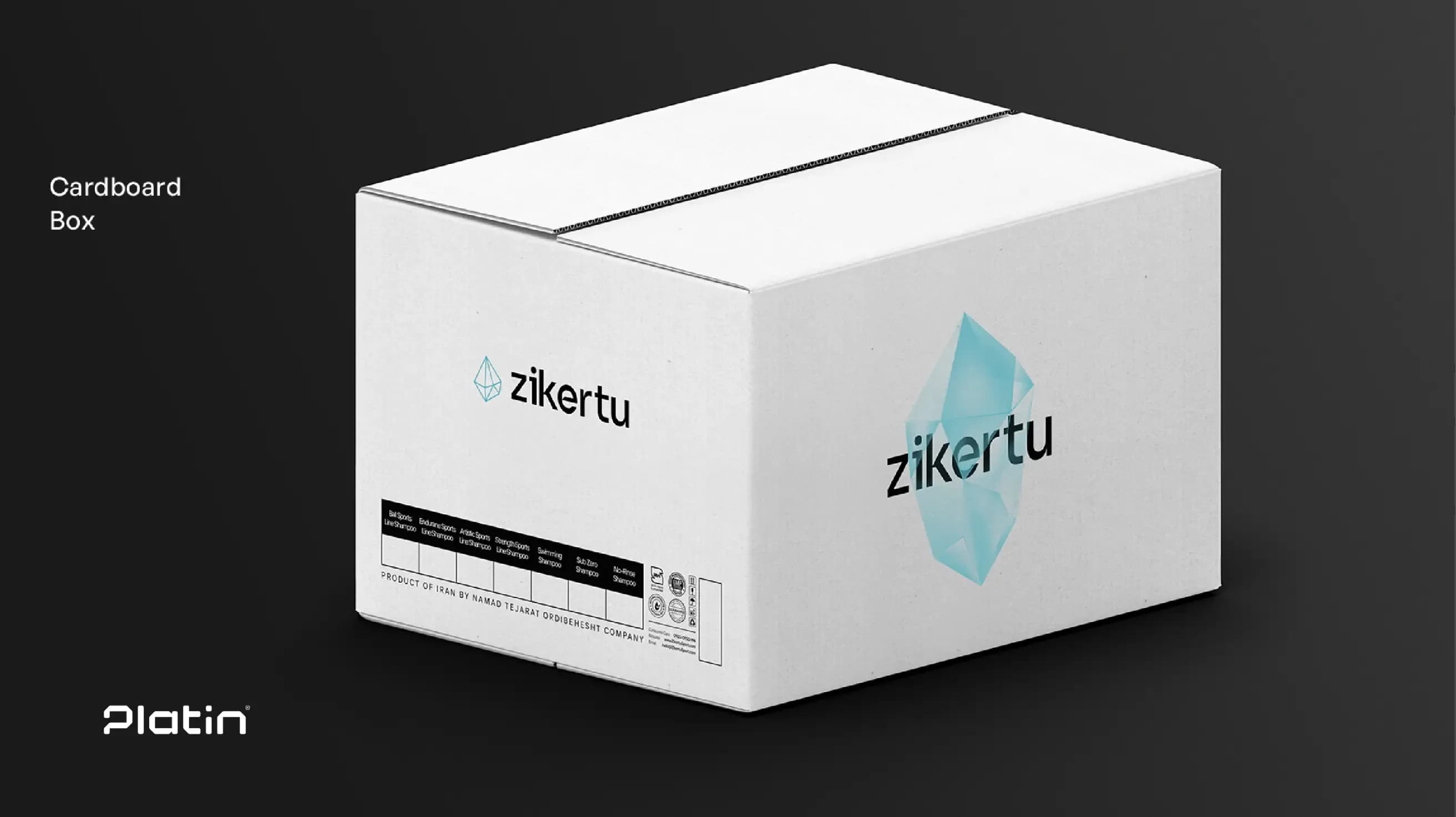
The diamond-inspired elements and the dedicated colors of each line were directly incorporated into the packaging design. As a result, each product had its own individual identity while still appearing as part of a unified family.
This system also enabled Zikerto to add new products to its portfolio in the future without disrupting the brand’s visual consistency. To develop a new line, only its color and graphic element need to be defined. The overall packaging structure remains unchanged, allowing the audience to maintain its visual connection with the brand.
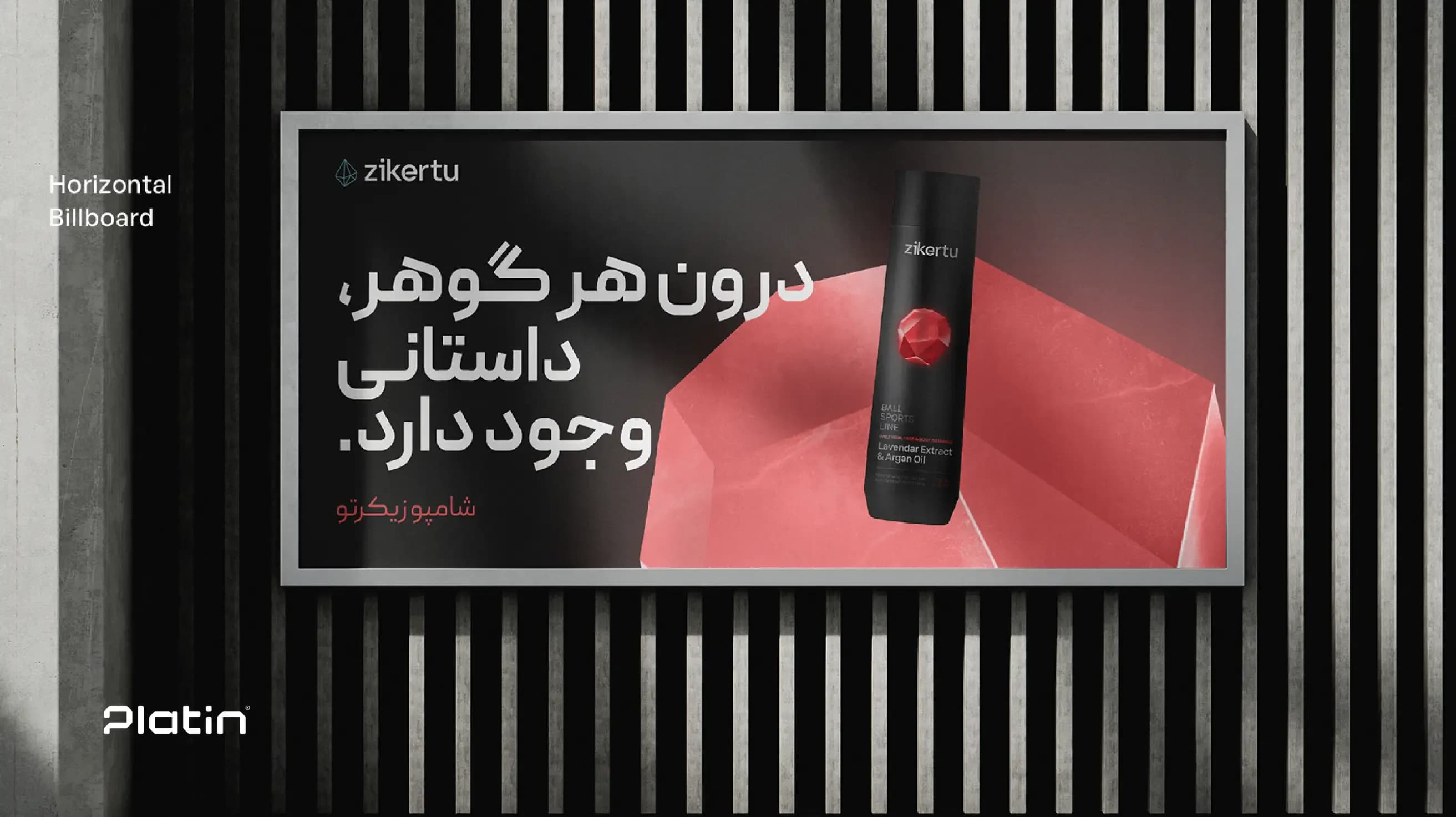
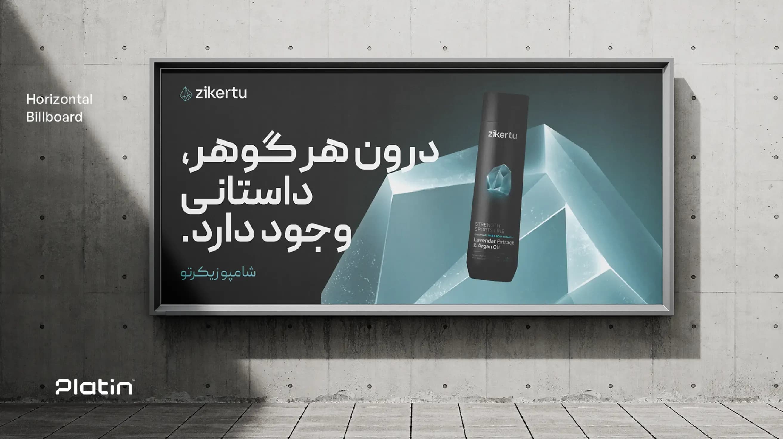
By redefining the concept of an athlete and focusing on an active lifestyle, Zikerto was able to connect with a wider range of audiences—people who may not be professional athletes but still care about their daily health and physical activity.
The use of black containers, transparent labels, clear color coding, and custom graphic elements helped Zikerto’s packaging stand out more clearly among local competitors and communicate a stronger sense of quality.
The organized information structure on the packaging helped customers identify the product type, application, and benefits at first glance. This could play an effective role in simplifying the purchase decision.
Zikerto’s packaging design was developed in a way that could also support future product expansion. This flexible structure allows new lines and products to be added without compromising the brand’s visual consistency.
By using transparent labels instead of direct printing on black containers, production and printing costs were controlled while preserving the professional appearance and perceived quality of the packaging.
The Zikerto packaging design project was more than a visual change. The project began with audience analysis and the redefinition of the brand’s positioning, eventually leading to the design of a coherent, practical, and scalable packaging system.
In this project, Platin Communications and Marketing Agency aimed to create a balance between brand strategy, visual identity, consumer behavior, and production limitations. The result was a packaging system that stands out on retail shelves, communicates the brand message more clearly, and supports Zikerto’s future development.
At Platin, packaging design is not limited to the appearance of the product. Every package should function as part of the brand strategy—a point where the audience encounters the product, makes a decision, and forms a perception of the brand’s quality.
To explore more about Platin’s approach and portfolio in this field, visit the “Packaging Design” section of our website.
